
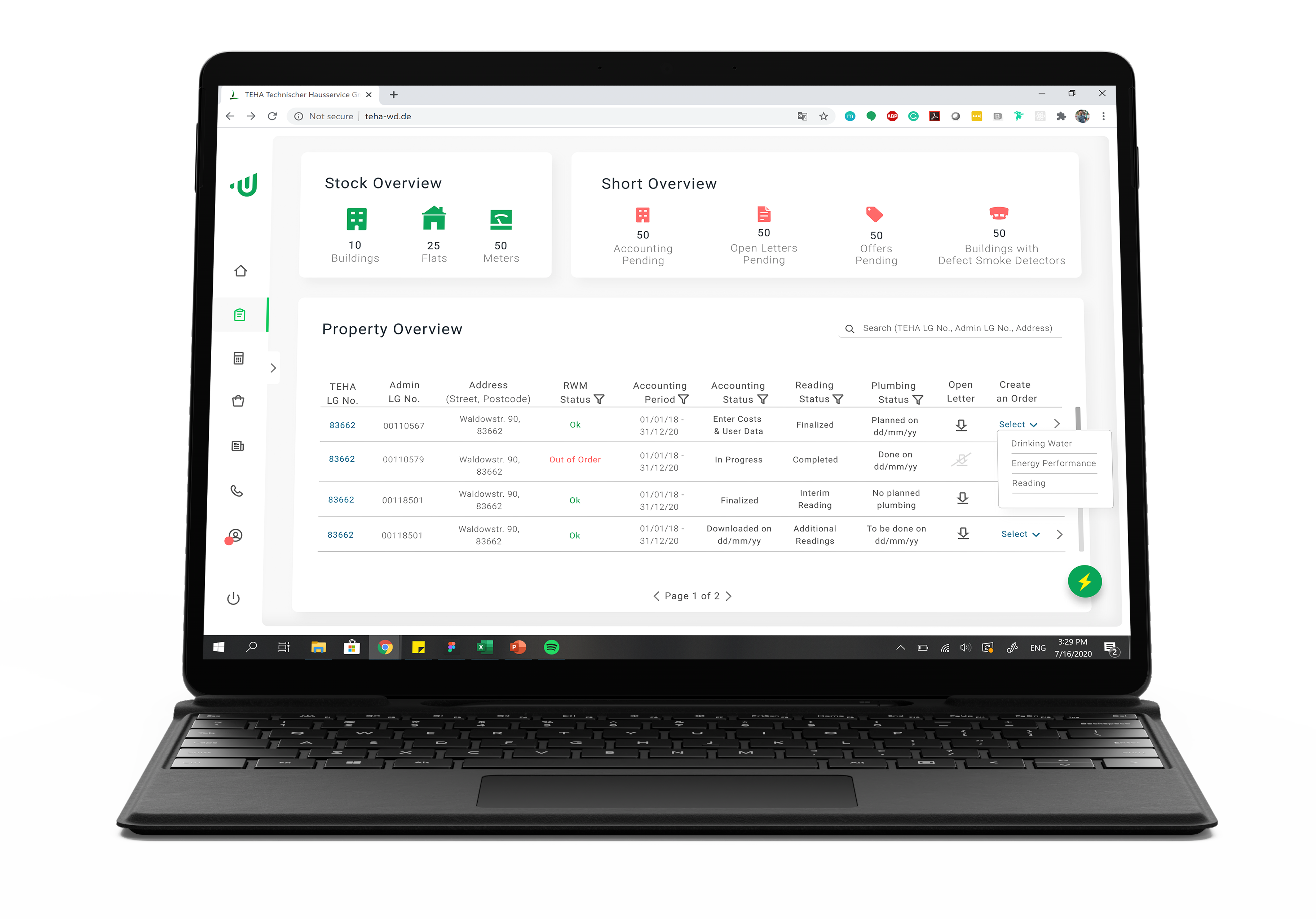
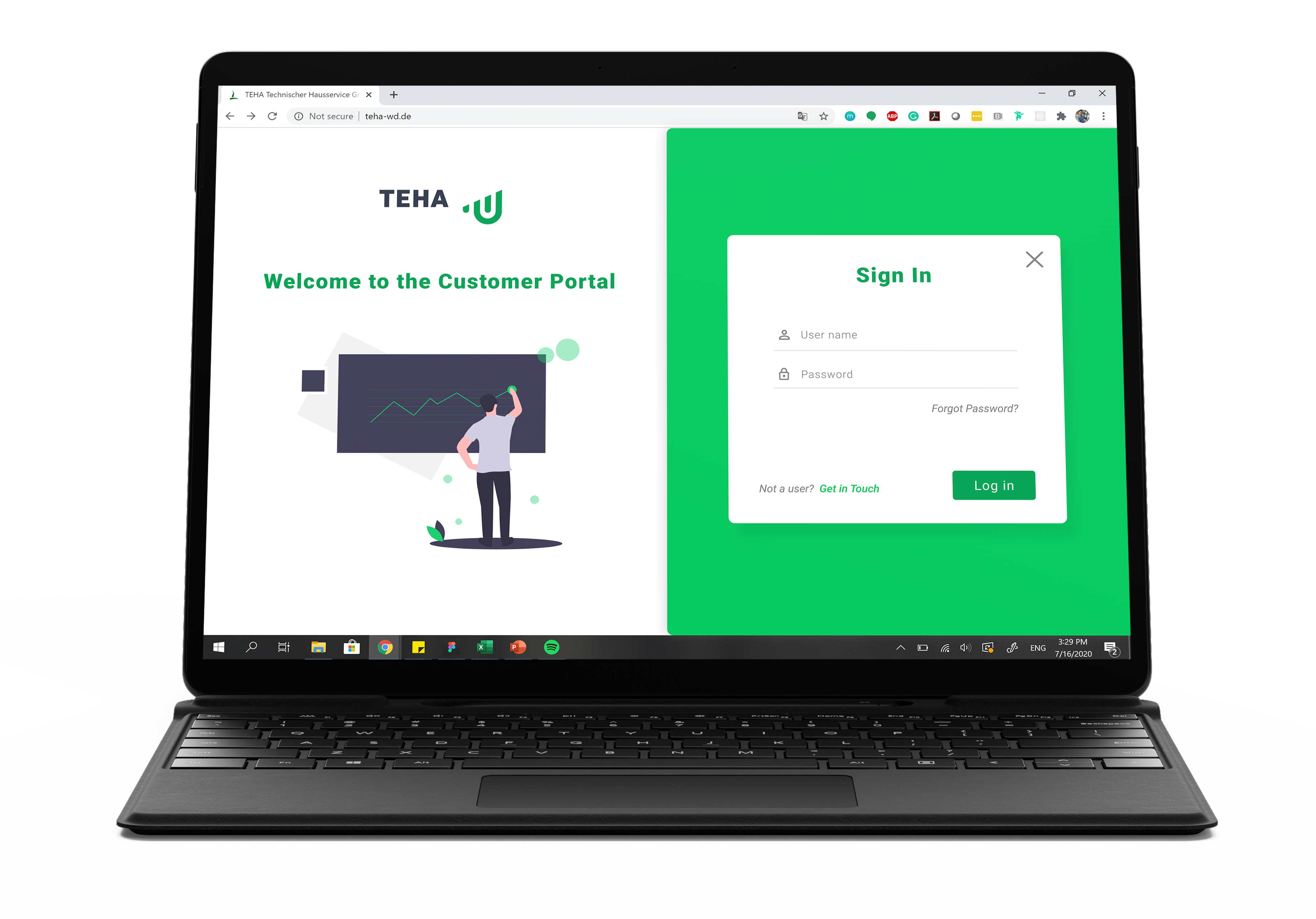
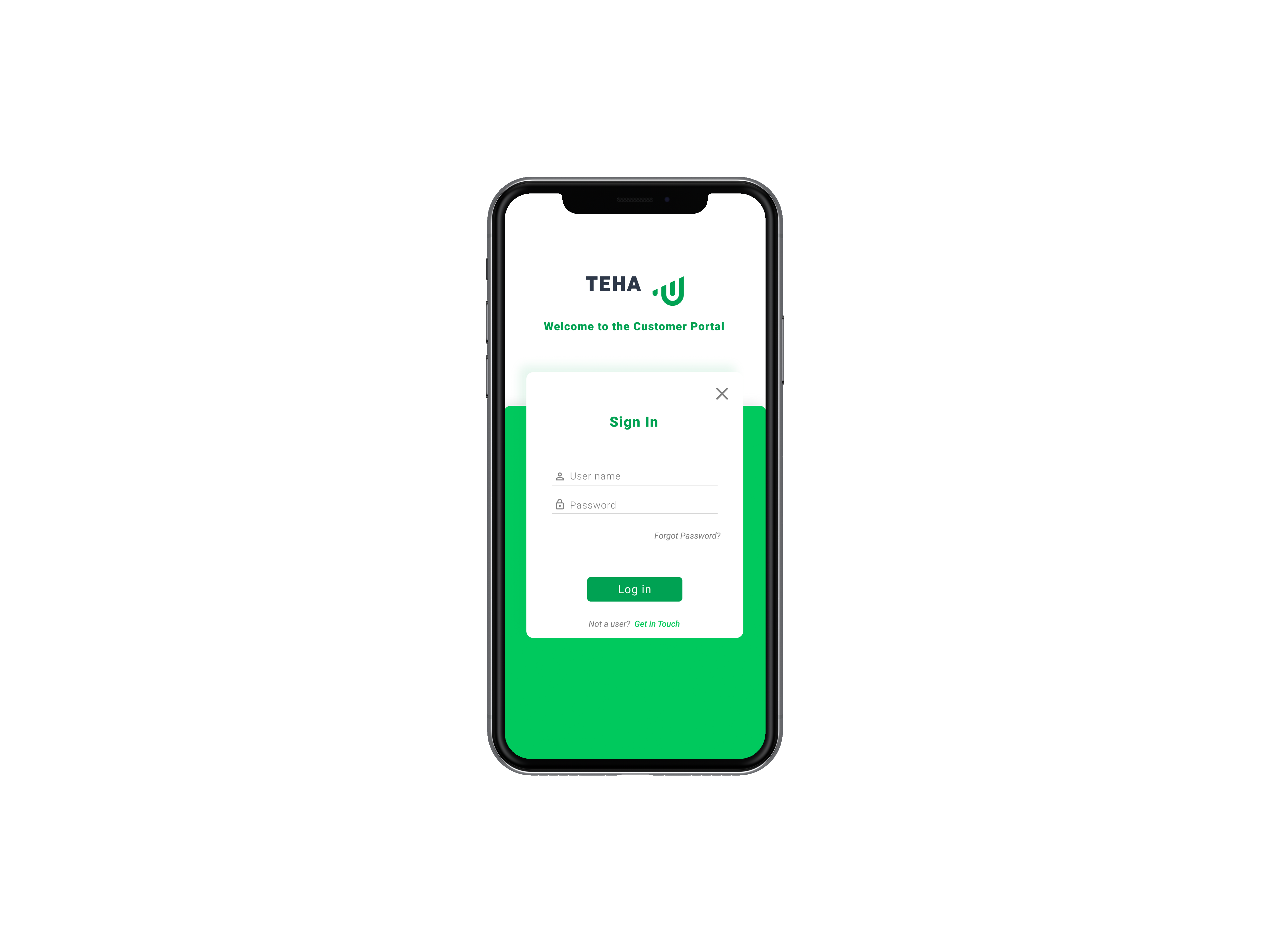
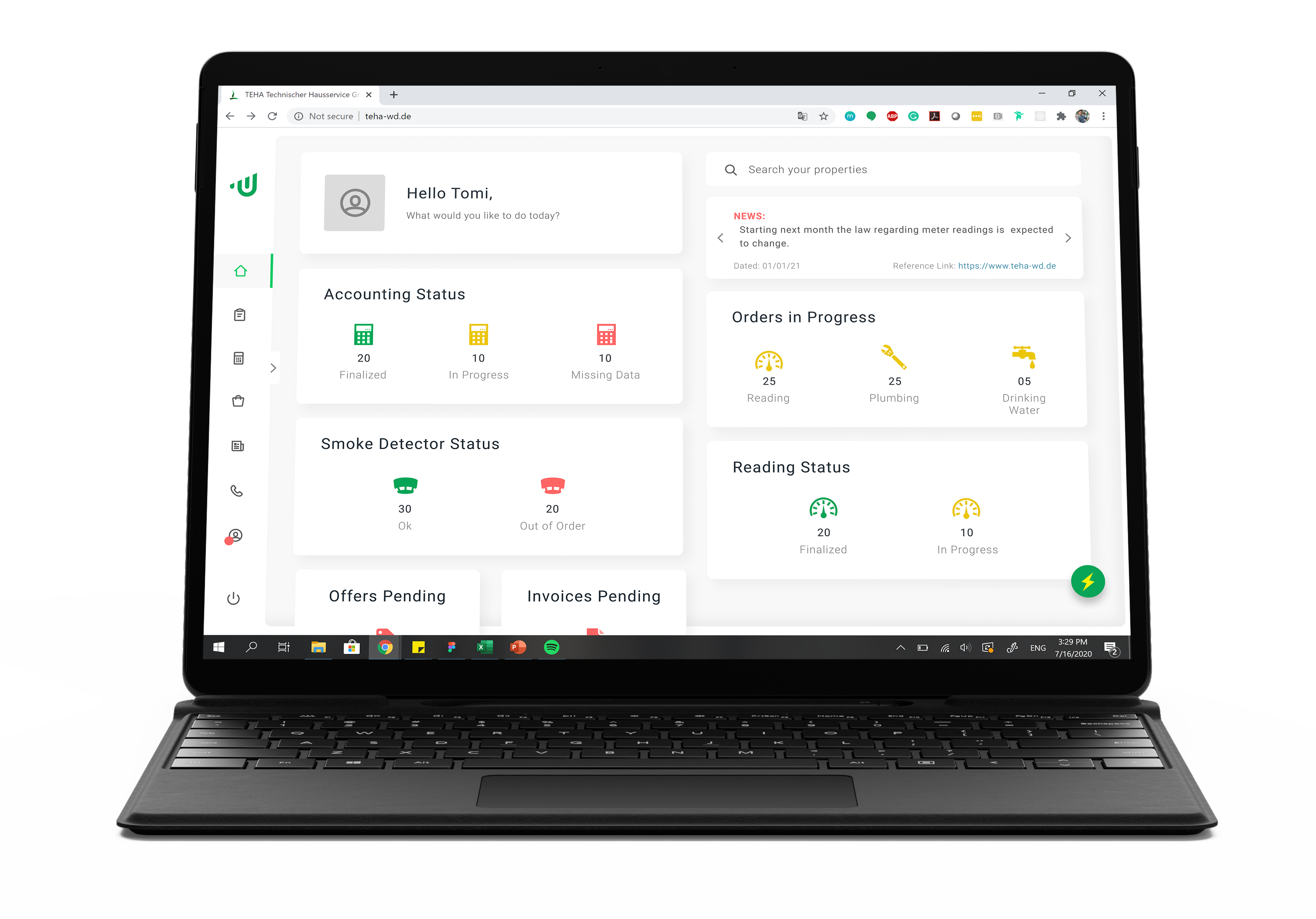
TEHA is a meter supplier based in Germany. They have contracts with various buildings across the country where their meters and smoke detectors are installed. Clients have access to a dashboard where they can make service requests or track meter-related data within the comfort of their home or office.
As the sole UX Designer on this project, the goal was to redesign the existing TEHA dashboard, make it user-friendly, responsive and modern.
TimeOwl is a time-tracking platform that connects to a user's Google Calendar and allows for seamless and automatic time logging. The application is still a work in progress and offers many new upcoming features.
As the product designer on this project, I was tasked with reimagining the user experience and interface, keeping in line with the new visual identity for the platform.
TEHA is a meter supplier based in Germany. They have contracts with various buildings across the country where their meters and smoke detectors are installed. Clients have access to a dashboard where they can make service requests or track meter-related data within the comfort of their home or office.
As the sole UX Designer on this project, the goal was to redesign the existing TEHA dashboard, make it user-friendly, responsive and modern.
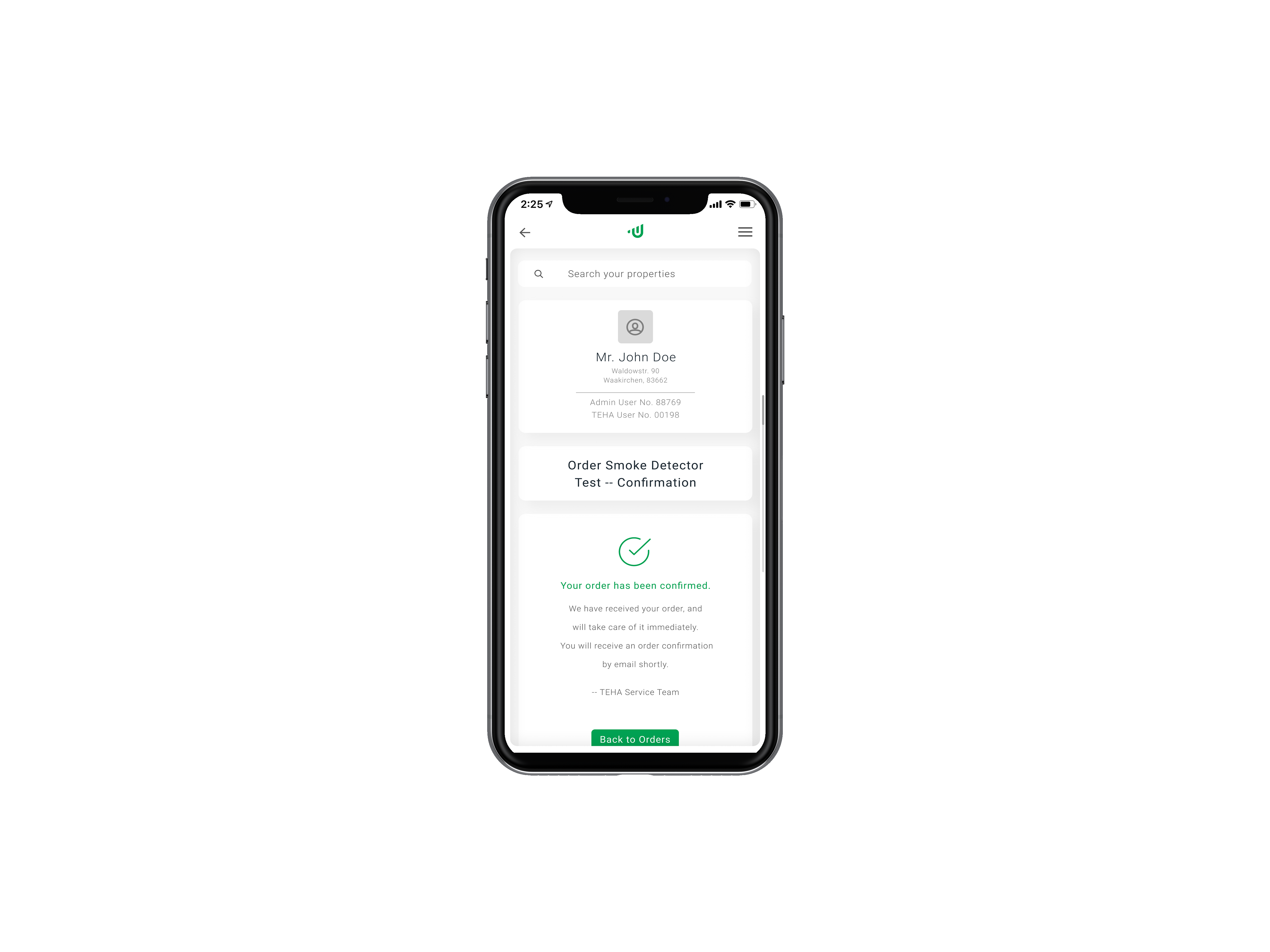
The Challenge
TEHA's existing dashboard was made a decade ago, and prior to the redesign looked similar to software running on Windows 98. The company came to the realization that their existing dashboard did not do justice to the service level they would like to present their consumers with. It lacked user-friendliness — confusing information architecture, redundant data, misleading iconography, and was visually inconsistent with the desired brand identity.
The Process
Being the only UX Designer on this project, I started by having an internal meeting with our project manager who had already taken all the relevant information from TEHA to begin this project. However, I insisted on leading a few meetings with the client to ask questions from a designer's perspective — who are the users, what is the approximate age demographic they fall under, are there any problems or constraints in the existing dashboard that we should be aware of, and many others.
At the same time, I made sure I understood how their business operated, what its goals were, the processes they followed at present with their clients, and how this dashboard helps them achieve their objectives — balancing the user needs with business goals is crucial. These meetings allowed me to understand why we were redesigning this dashboard and what the client was asking for versus what they needed.
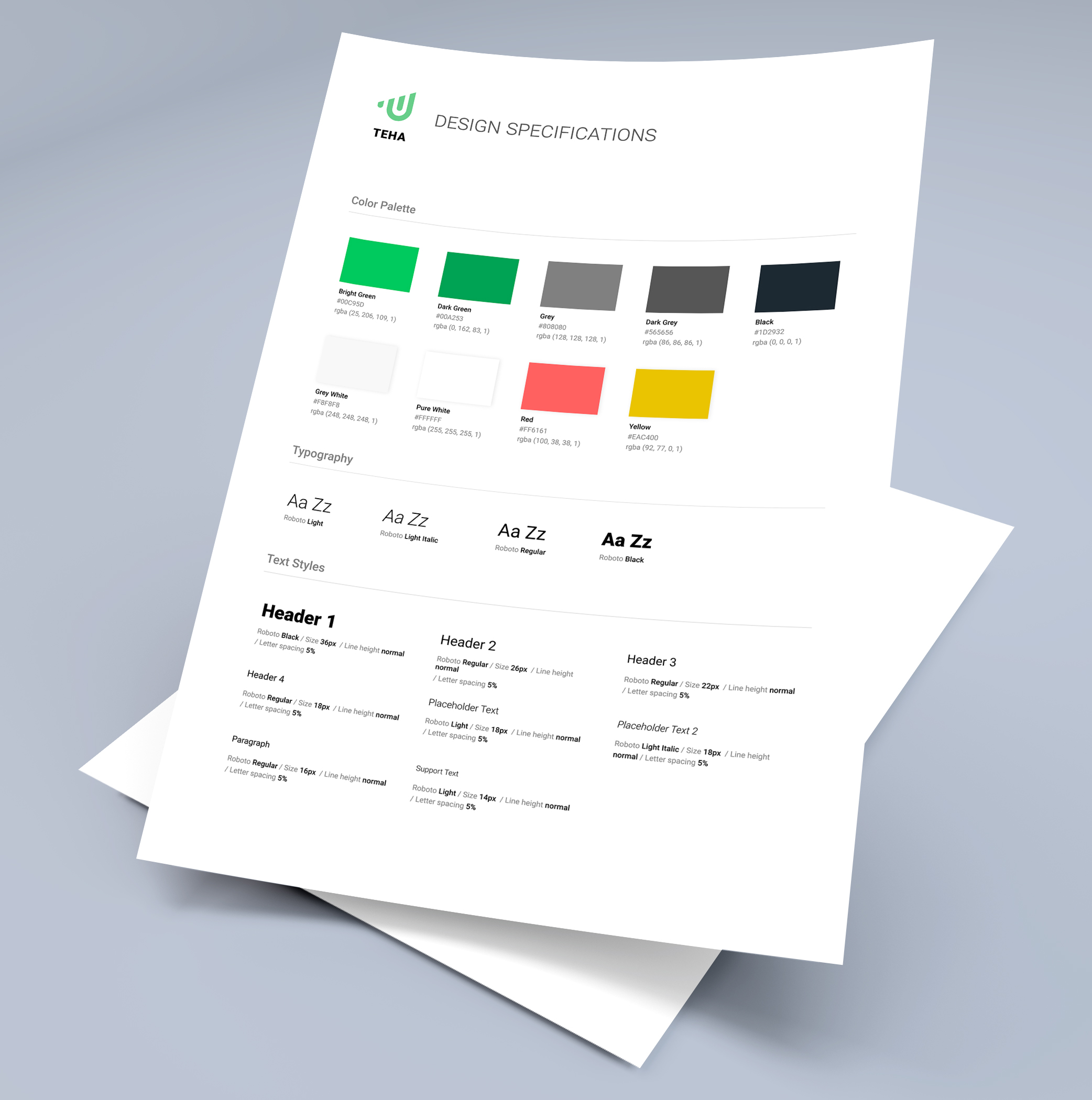
Moving on to the design process, this project was executed using the Agile software development methodology. As such, we worked in weekly sprints where everyone was given tickets (tasks) to complete. I started defining the information architecture based on the information we received from the client, followed by sketching out rough mockups while looking for inspiration. The user journey was meant to be as simple as possible, with the users experiencing the emotions of certainty and trust as they navigated through the experience. These initial mockups and thoughts led me to create a design specification sheet that outlined the required visual language the developers needed to follow — the font, sizes, colors, etc. Then came low-fidelity designs on Figma, which were then converted to high-fidelity after an internal as well as client review and feedback session. The last step was to ensure every new screen created in the user journey was navigable as a design prototype for easier understanding for the developers, client, and other relevant stakeholders.
It is also important to mention that during the span of the project, there were constant feedback sessions after which new iterations would be made to solve potential problems in the product use case and roadmap. Finally, the team for this project comprised one UX designer (myself), ten developers, and one project manager. Hence, regular and effective communication (especially while working remotely) was essential to making this project a success.
The Process
Being the only UX Designer on this project, I started by having an internal meeting with our project manager who had already taken all the relevant information from TEHA to begin this project. However, I insisted on leading a few meetings with the client to ask questions from a designer's perspective — who are the users, what is the approximate age demographic they fall under, are there any problems or constraints in the existing dashboard that we should be aware of, and many others.
At the same time, I made sure I understood how their business operated, what its goals were, the processes they followed at present with their clients, and how this dashboard helps them achieve their objectives — balancing the user needs with business goals is crucial. These meetings allowed me to understand why we were redesigning this dashboard and what the client was asking for versus what they needed.
Moving on to the design process, this project was executed using the Agile software development methodology. As such, we worked in weekly sprints where everyone was given tickets (tasks) to complete. I started defining the information architecture based on the information we received from the client, followed by sketching out rough mockups while looking for inspiration. The user journey was meant to be as simple as possible, with the users experiencing the emotions of certainty and trust as they navigated through the experience. These initial mockups and thoughts led me to create a design specification sheet that outlined the required visual language the developers needed to follow — the font, sizes, colors, etc. Then came low-fidelity designs on Figma, which were then converted to high-fidelity after an internal as well as client review and feedback session. The last step was to ensure every new screen created in the user journey was navigable as a design prototype for easier understanding for the developers, client, and other relevant stakeholders.
It is important to mention that the team for this project comprised of one UX designer (myself), ten developers, and one project manager. Hence, regular and effective communication (especially while working remotely) was essential to making this project a success.
The Constraints & Issues
With a project this size, there were bound to be constraints. As a UX designer, the largest issue was the lack of access to the target users who would be using this dashboard. At no point in the process was I able to validate my assumptions, or observe a 35 to 60 year old German (the target user) use the dashboard we were creating. All we had to work with was data from the client from their market research, based on which we made assumptions to operate under. While I tried my best to change this by making appeals to the client and my project manager, it did not bear much fruit because we were a "software house" and we "create what the client wants". This made me very uncomfortable because operating under false assumptions is the most dangerous thing a designer can do — it has the capability to break your product and incur heavy losses to the company.
From a technical standpoint, the major constraint was ensuring all UI elements were from the Angular Material UI library so our developers had an easier time programming. While this was not an issue, one of the requirements from our CTO was to make this dashboard unique at the same time — challenge accepted.
The Lessons
This was the largest and longest project I have worked on so far in my career. It took us 8 months to deliver this project, taking into account rework and changes in client specifications. However, this project allowed me to learn and grow as a designer.
This was the second time I had worked with a team of software developers and speaking to them in a language they understood was something I improved along the way. Knowing some front-end development myself proved to be a great asset in this regard as it allowed me to explain how certain elements would be programmed. Moreover, I honed my ability to explain things from a user-centered point of view to convince the relevant stakeholders regarding the redesign proposed. Shortly stated, my communication and convincing skills were polished.
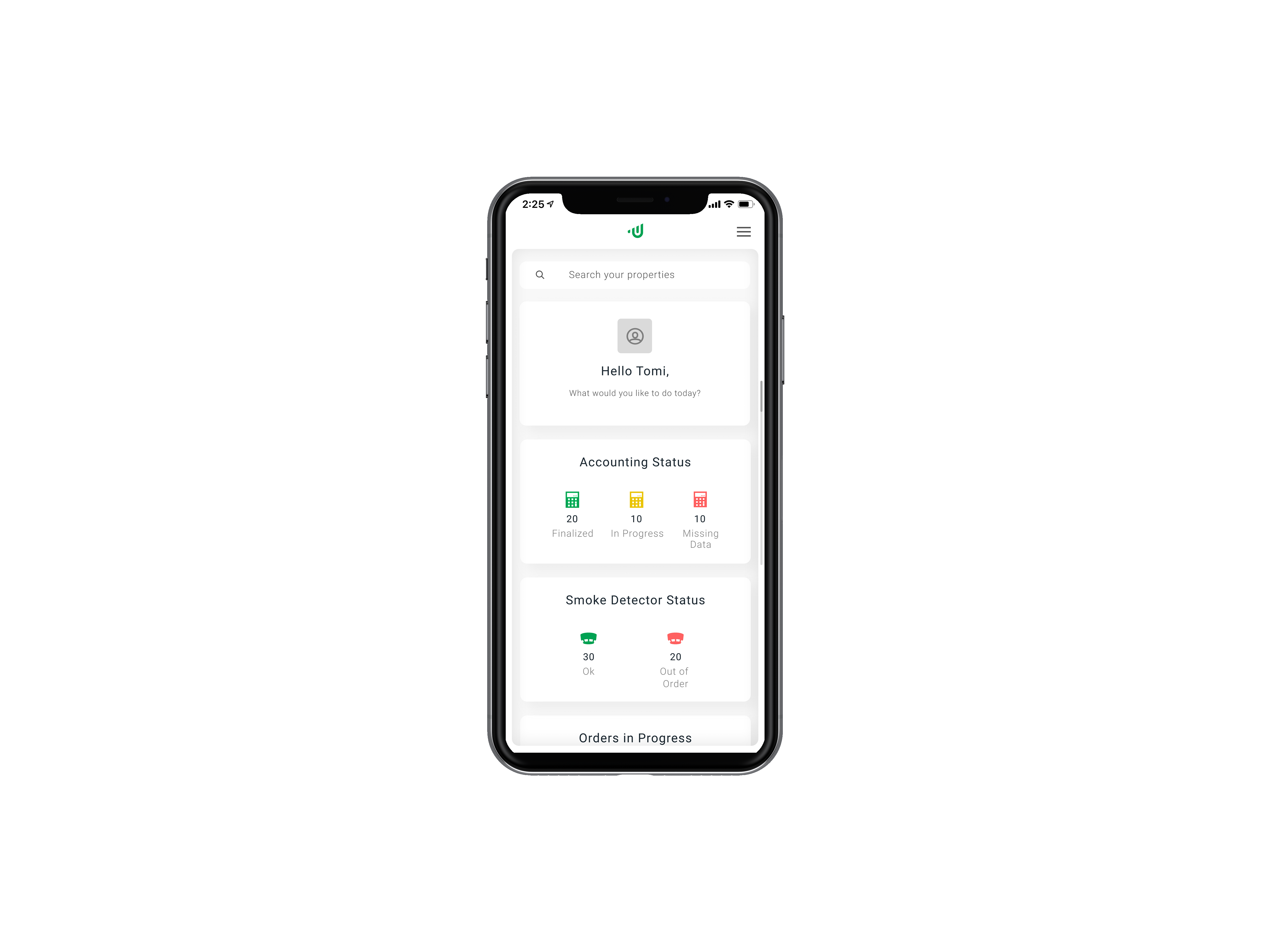
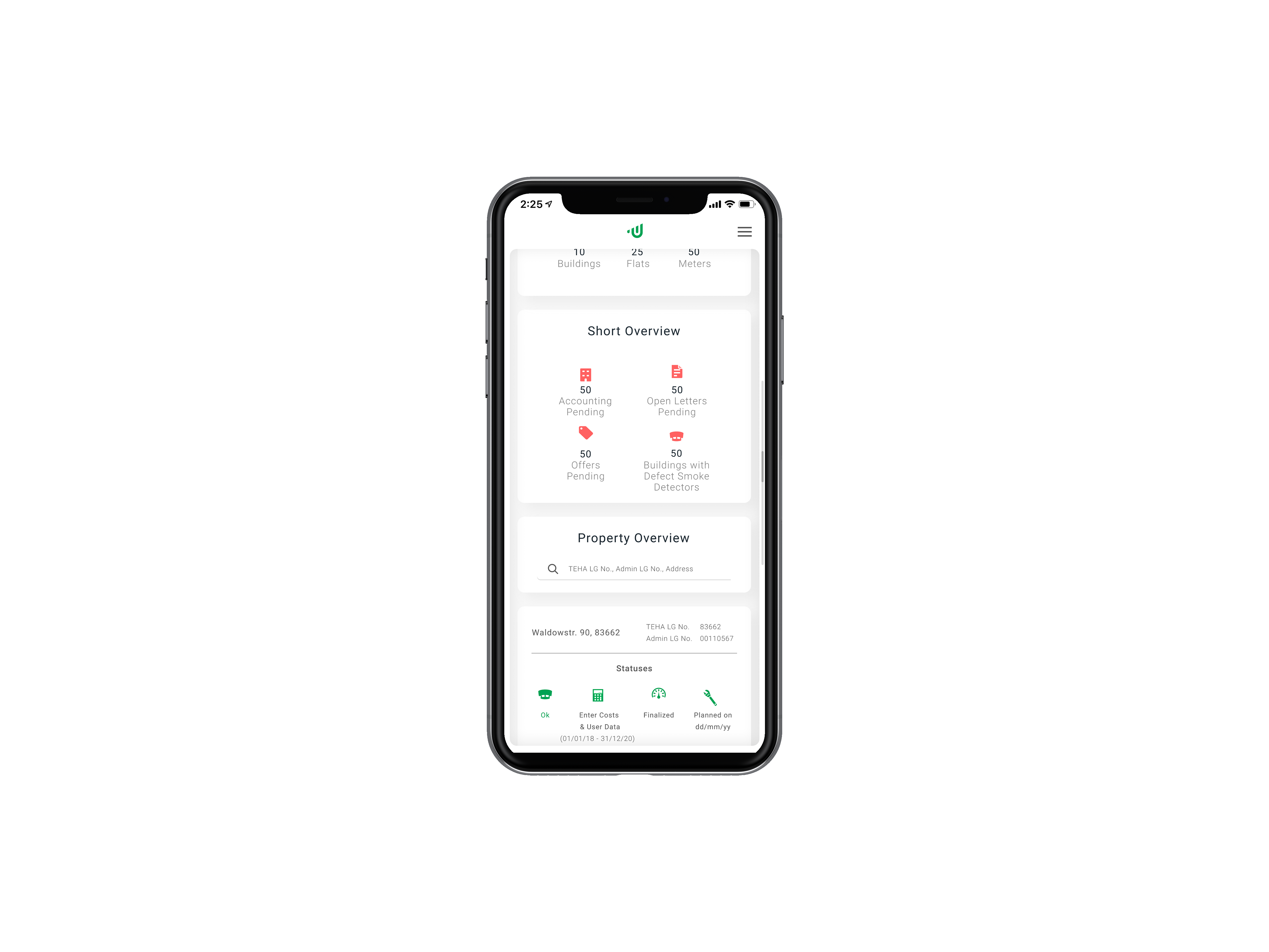
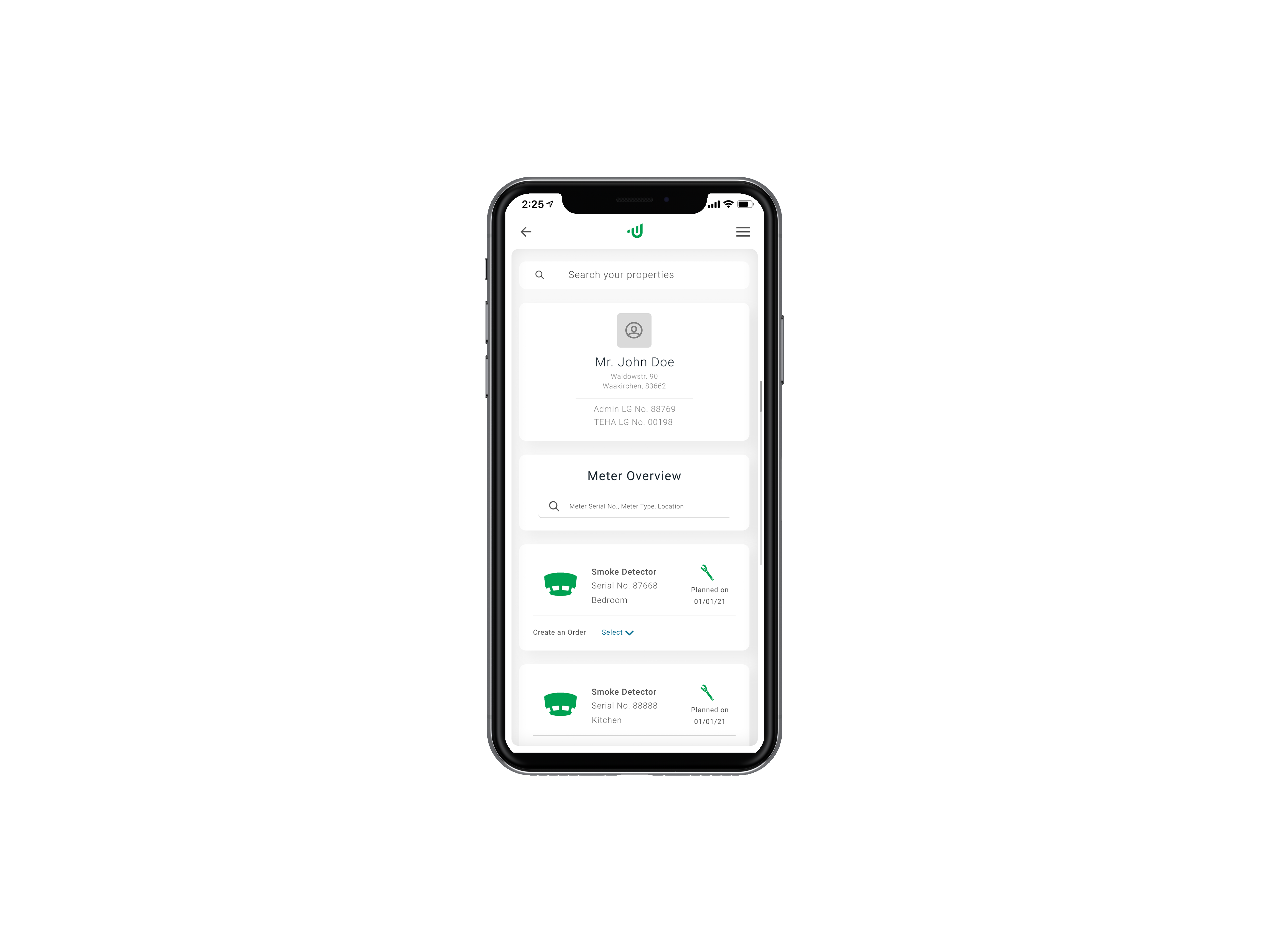
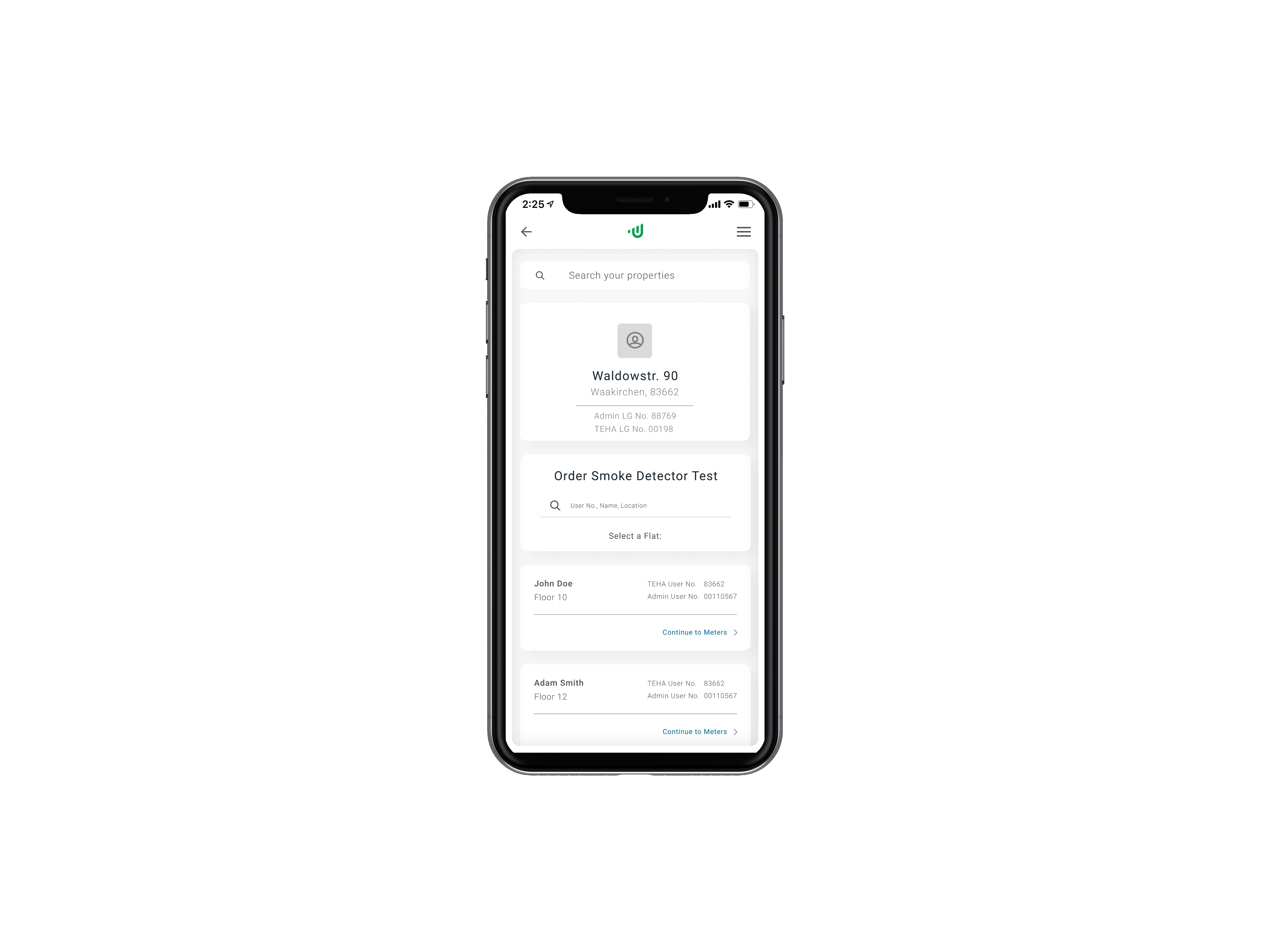
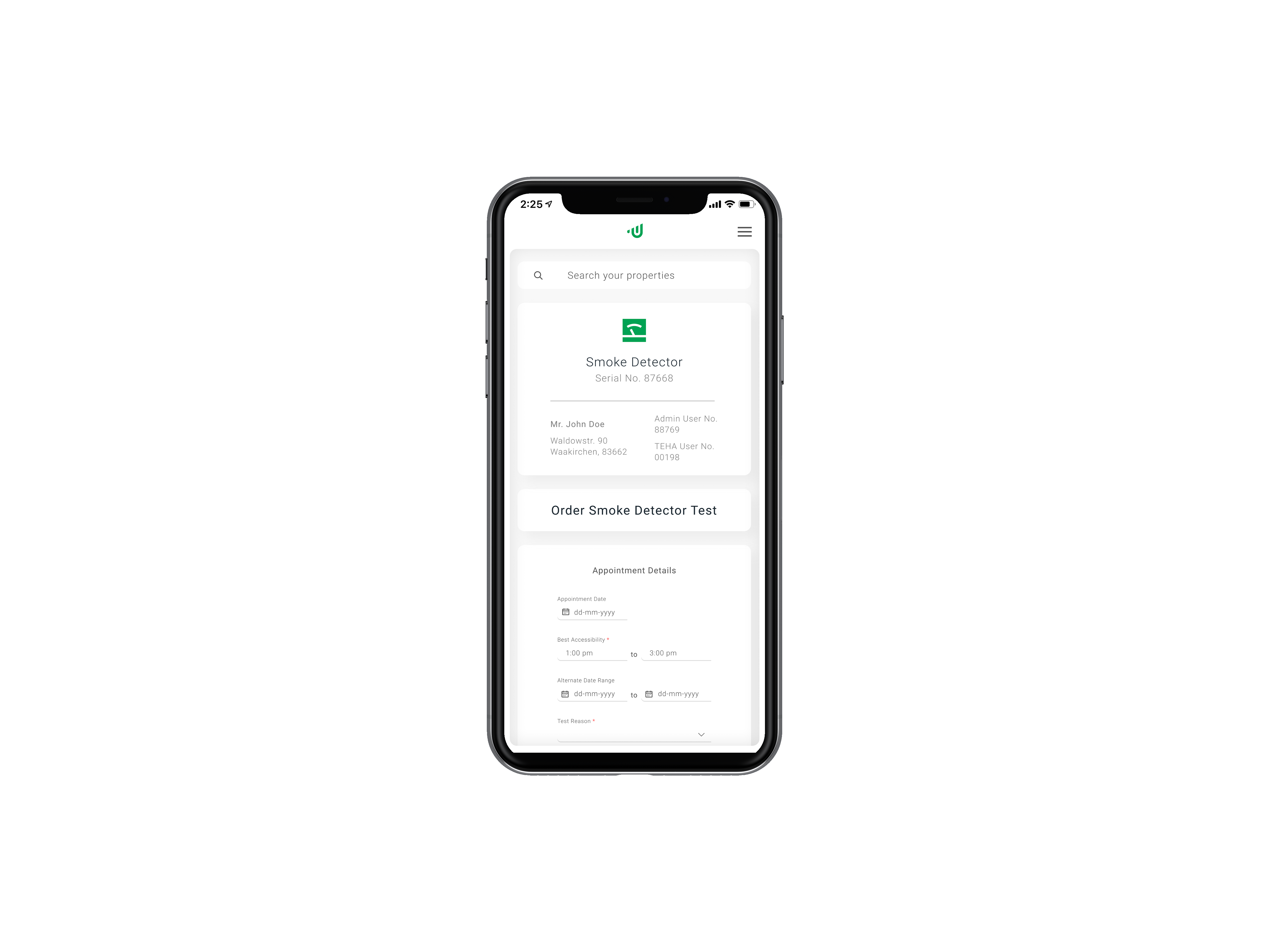
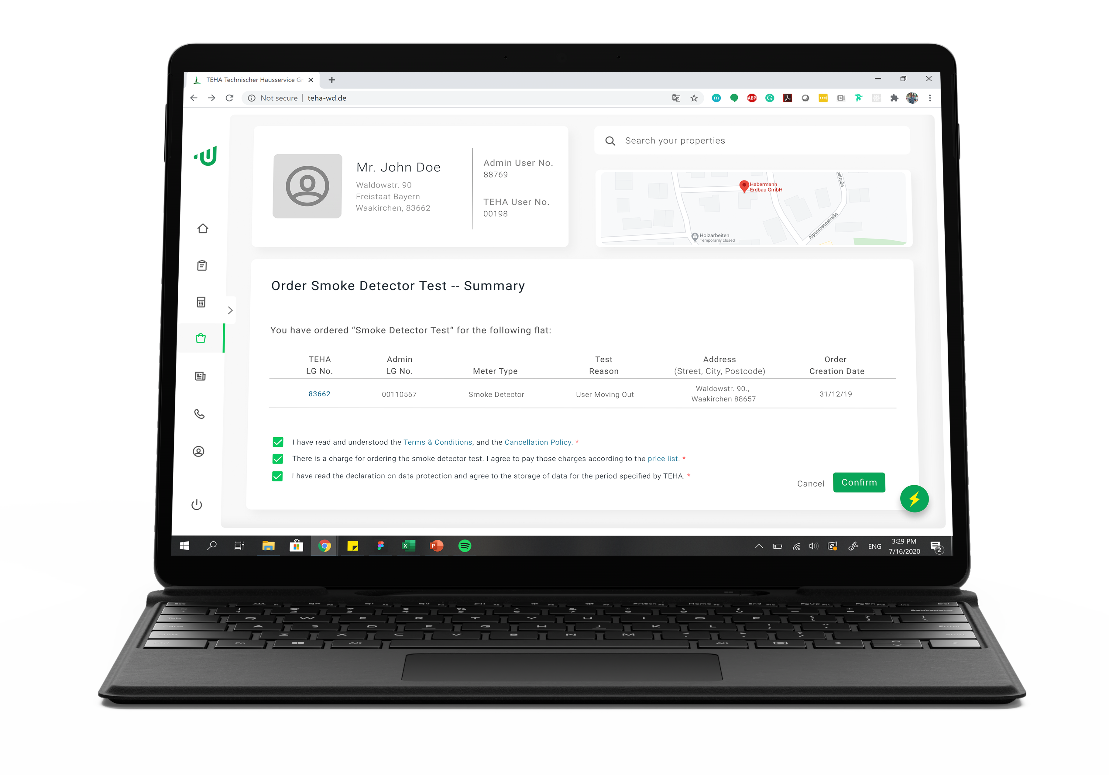
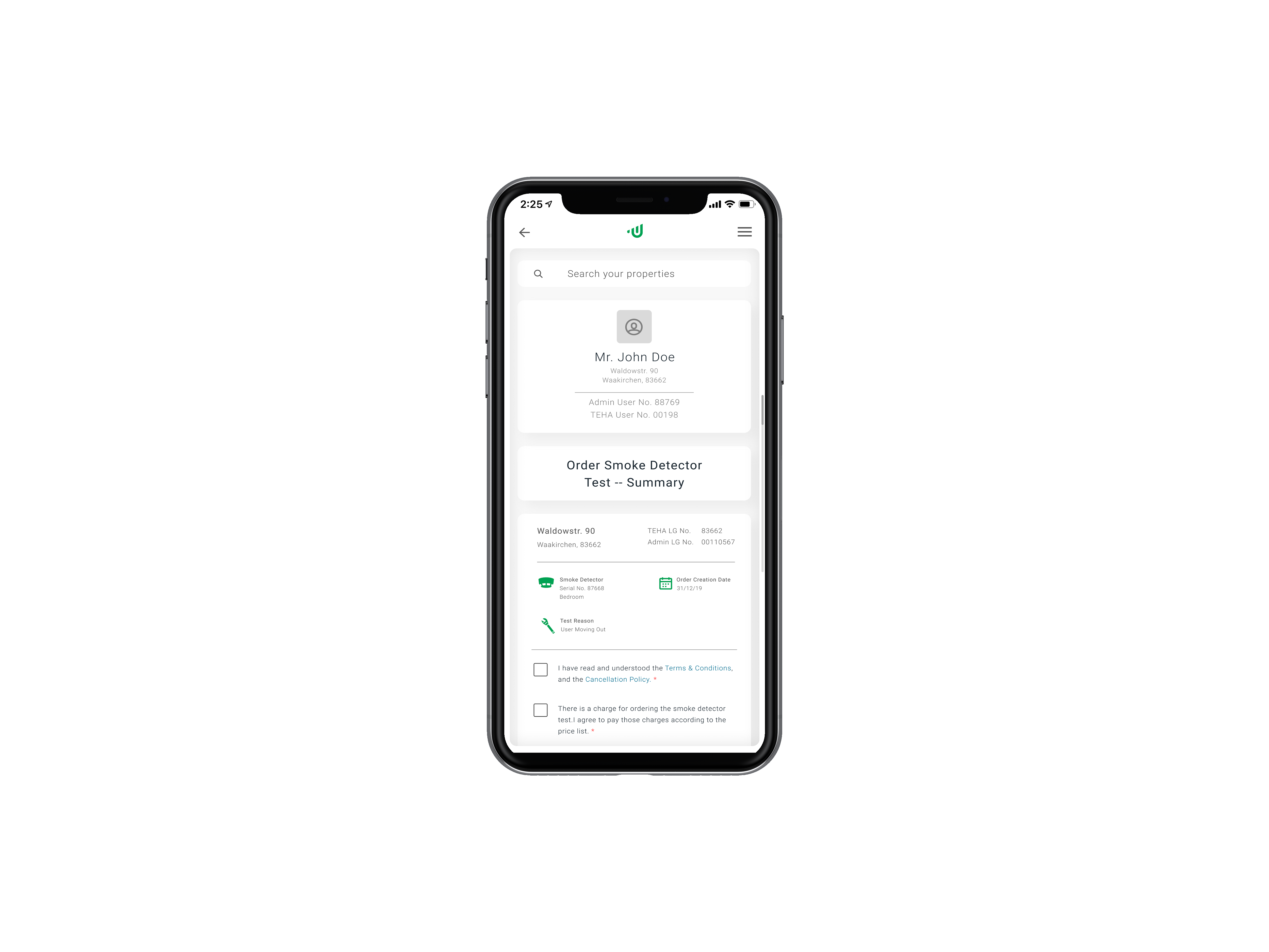
Additionally, I learned new and creative ways of handling responsive dashboards, especially when it came to handling table data for the mobile views — the use of effective yet consistent iconography allowed me to fit the same data into a smaller screen while converting each row into a card. You can see examples in the carousel below.
The Lessons
This was the largest and longest project I have worked on so far in my career. It took us 8 months to deliver this project, taking into account rework and changes in client specifications. However, this project allowed me to learn and grow as a designer.
This was the second time I had worked with software developers and speaking to them in a language they understood was something I improved along the way. Knowing some front-end development myself proved to be a great asset in this regard as it allowed me to explain how certain elements would be programmed. Moreover, I honed my ability to explain things from a user-centered point of view to convince the relevant stakeholders regarding the redesign proposed. Shortly stated, my communication skill was polished.
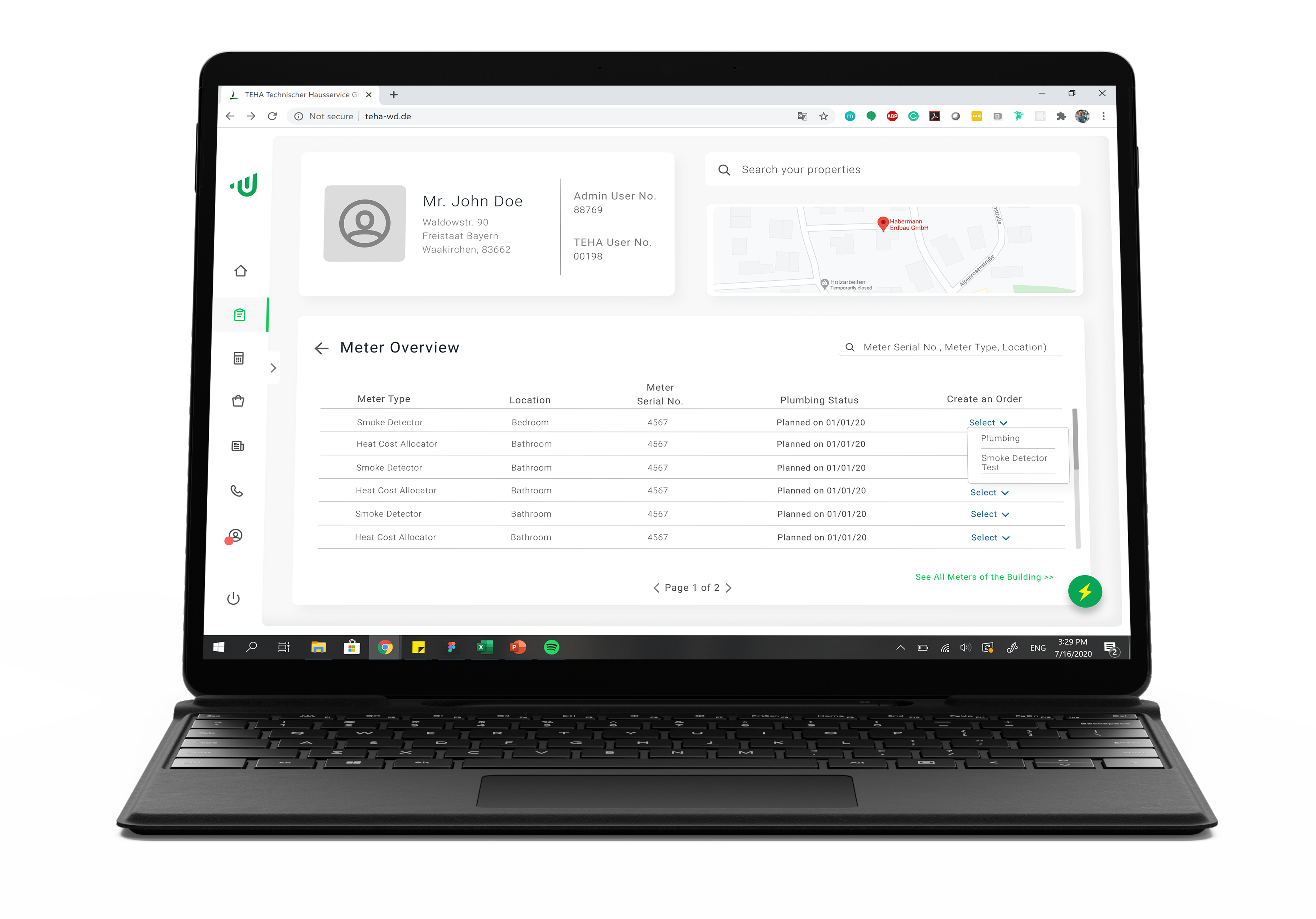
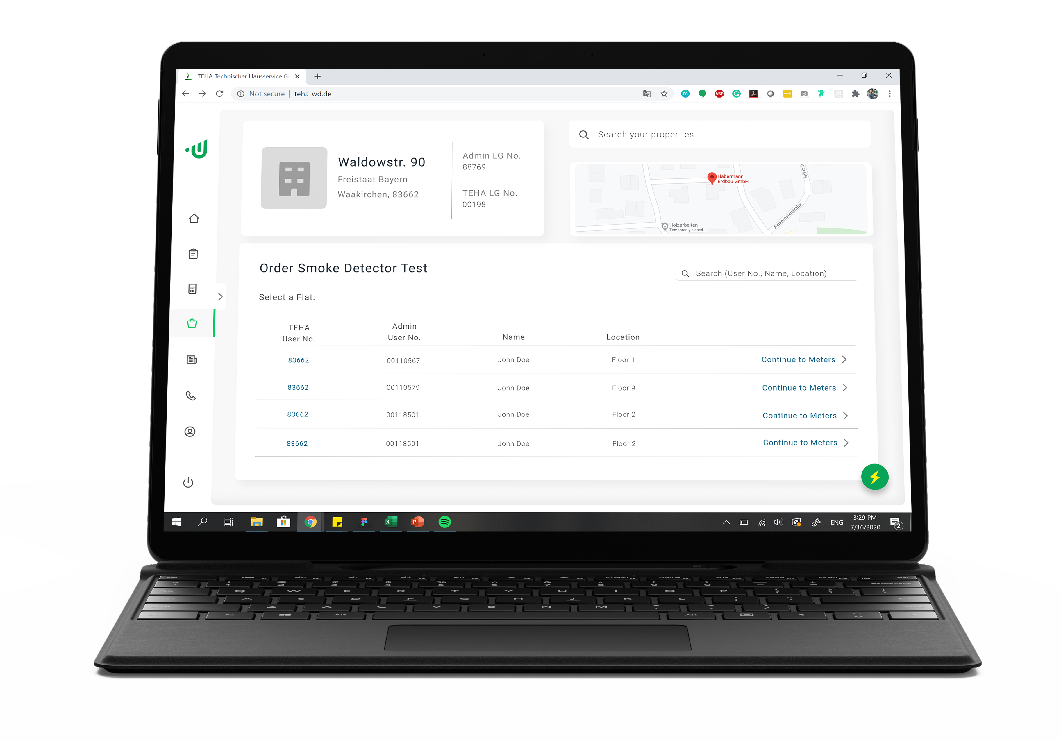
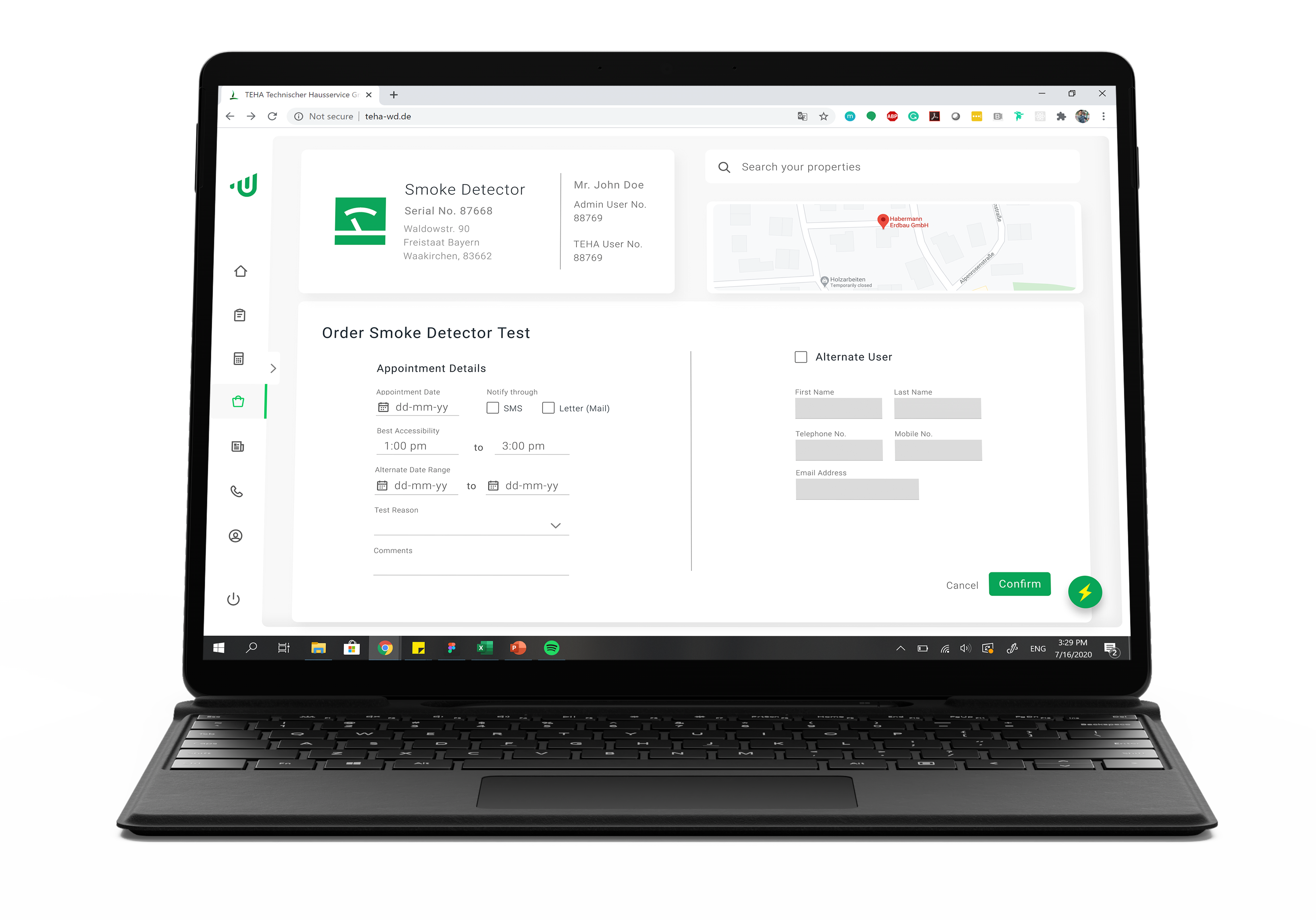
The Final Product
The Final Product
Zeerak Fayiz - Copyright 2022 ©