
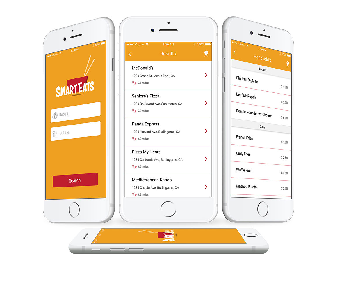
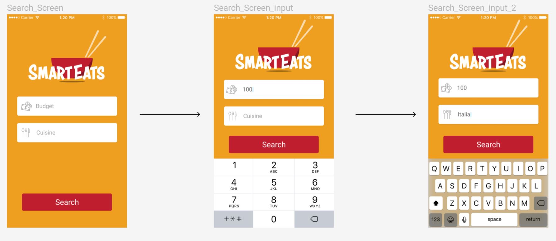
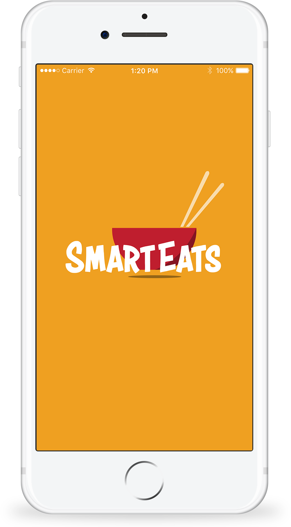
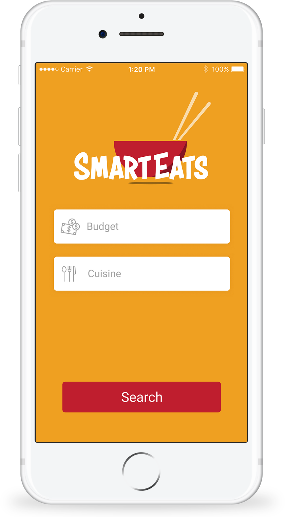
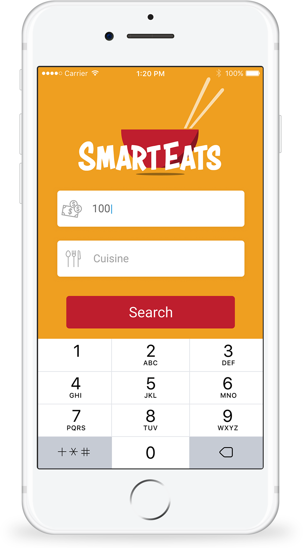
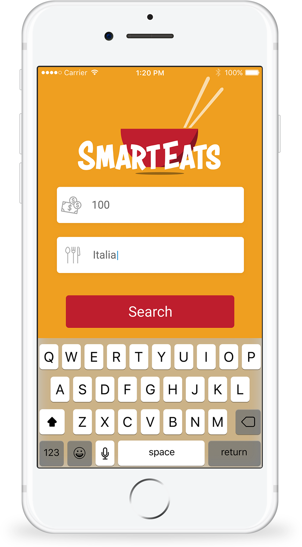
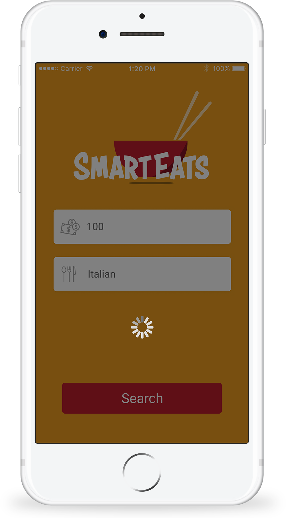
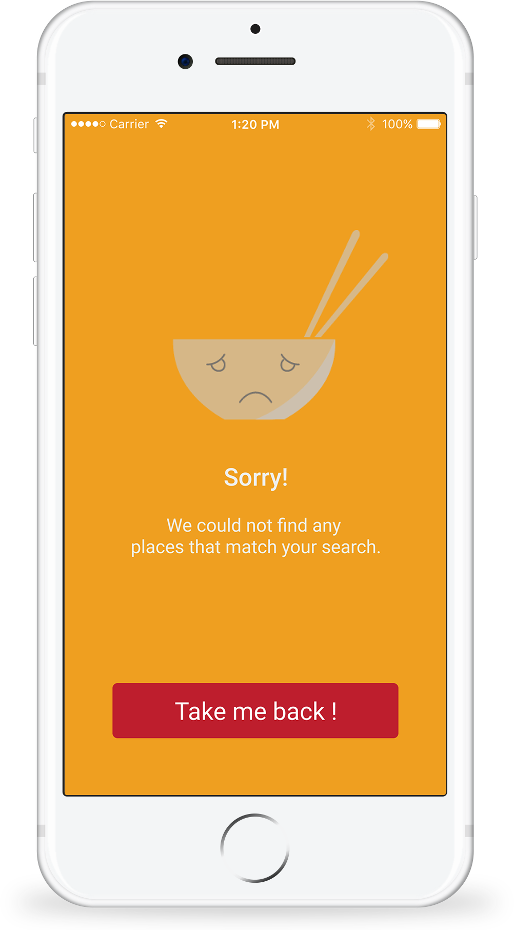
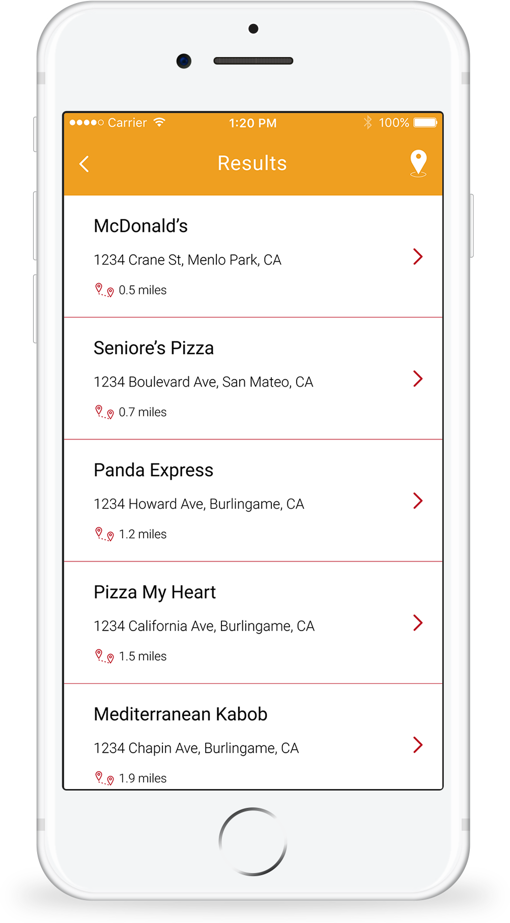
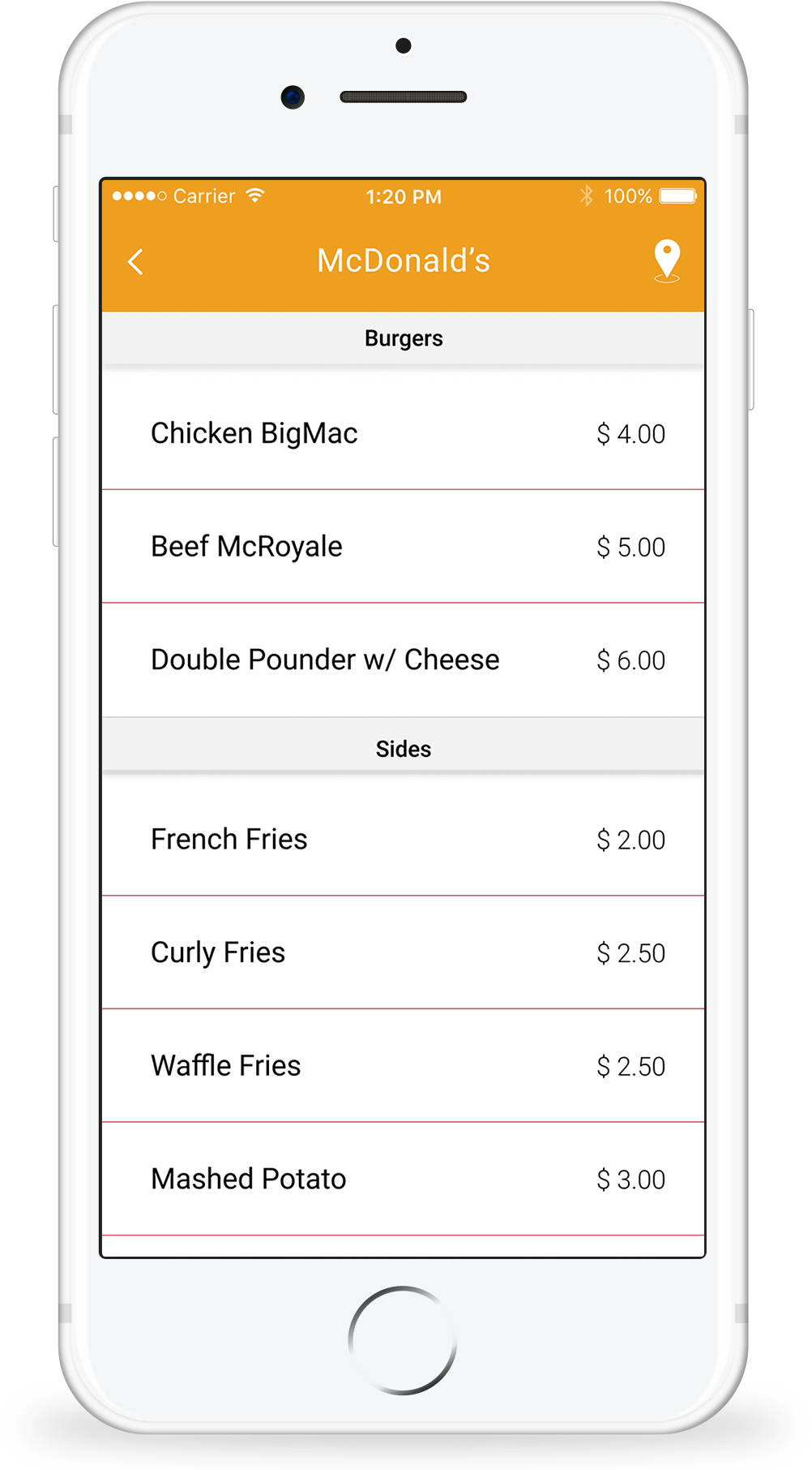
SmartEats is an app that allows users to search for, and filter affordable restaurants around them by inputting how much money they are willing to spend, and take a look at respective menus.
As the designer, I created all the visuals from scratch, using Adobe Illustrator, followed by Figma, for the UI design.
IDEA
Being college students ourselves, we had experienced the struggle of having only a limited amount of money to spend on food. In most cases, we found ourselves trying to find places on Yelp, yet still not having a clear idea of food prices in places around us.
Do we just sit and wait for someone to create a solution?
Nope. We went ahead and built it.
PROCESS
After coming up with a solution to the problem, a friend and I teamed up to work on this project. Him being a developer, and me a designer.
It started with us mapping out the general workflow of the app on paper (yes, old school drawing is always fun!). Followed by this was the developer's search for the API and working on the back-end, while I started creating low to high-fidelity designs for the interface.
Not to forget, no design process is complete without feedback and user-testing (we had friends test it out!).
FINISHING
Once the back-end was up and running, it was time to implement the designed UI. I believe the hardest part on the developing the front-end was making sure that the constraints were just right for each iOS running device.
On the designer end, the main struggle was creating a user interface that would make the amount of data easy, and nice to look at. This involved using a lot of elements, from type hierarchy to icons, to an energetic yet sophisticated color scheme.
Thus, SmartEats was born.
ITERATIONS
#1
Feedback:
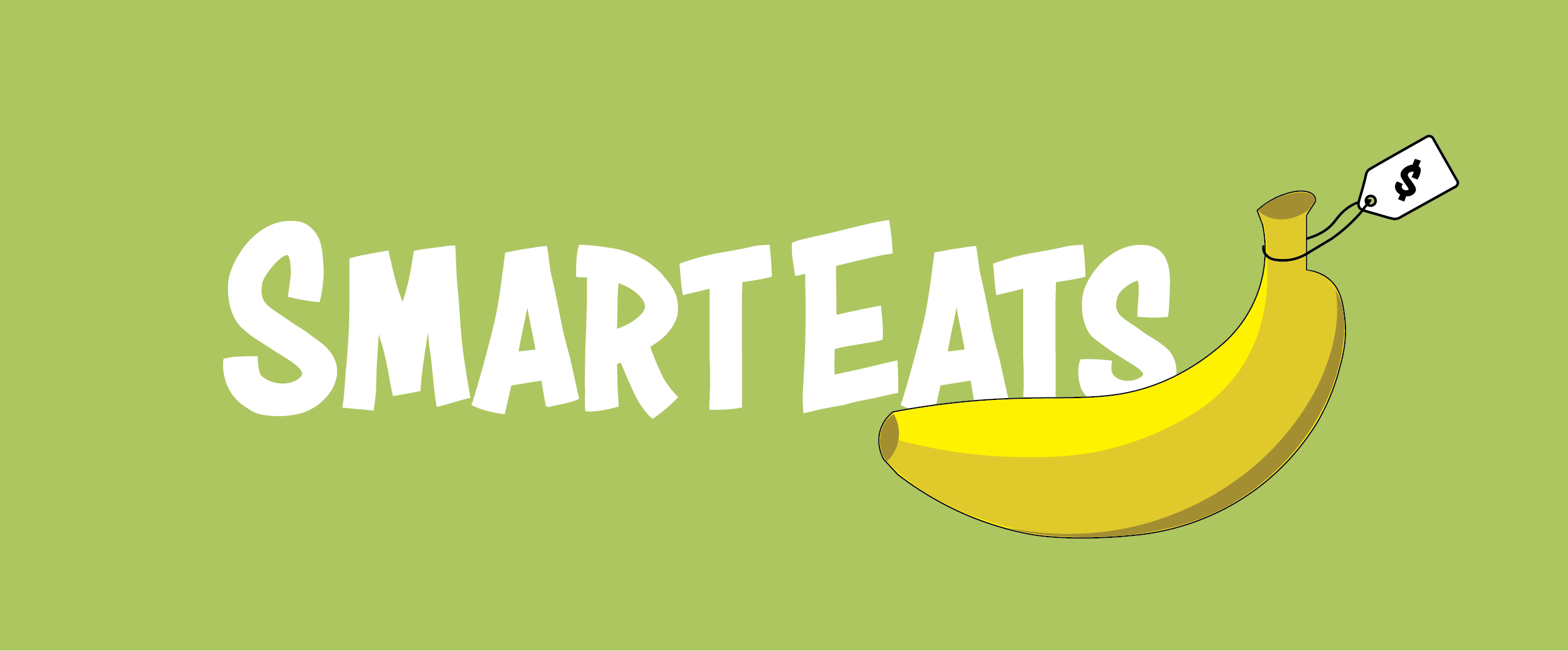
1. "Looks dull, and the green color reminds me of puke"
2. "Is it an app for healthy food?"
3. "When I think of a meal, I don't think of a banana. Some other food item would be better suited"
#1
Feedback:
1. "Looks dull, and the green color reminds me of puke"
2. "Is it an app for healthy food?"
3. "When I think of a meal, I don't think of a banana. Some other food item would be better suited"
#1
Feedback:
1. "Looks dull, and the green color reminds me of puke"
2. "Is it an app for healthy food?"
3. "When I think of a meal, I don't think of a banana. Some other food item would be better suited"
#1
Feedback:
1. "Looks dull, and the green color reminds me of puke"
2. "Is it an app for healthy food?"
3. "When I think of a meal, I don't think of a banana. Some other food item would be better suited"
#1
Feedback:
1. "Looks dull, and the green color reminds me of puke"
2. "Is it an app for healthy food?"
3. "When I think of a meal, I don't think of a banana. Some other food item would be better suited"
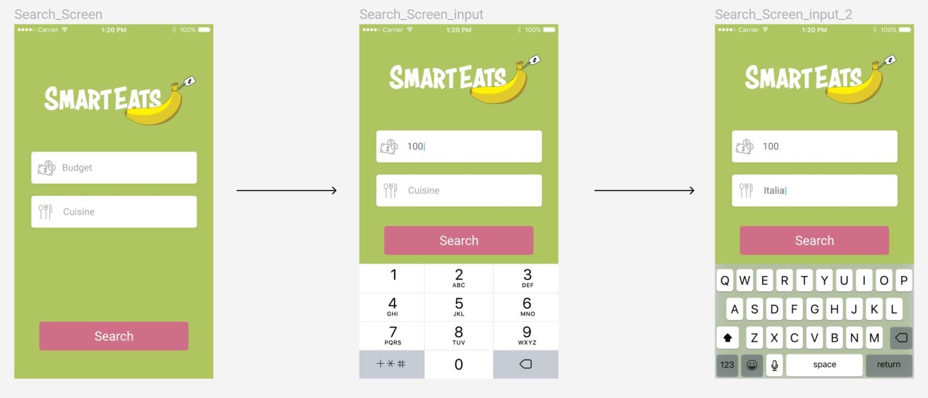
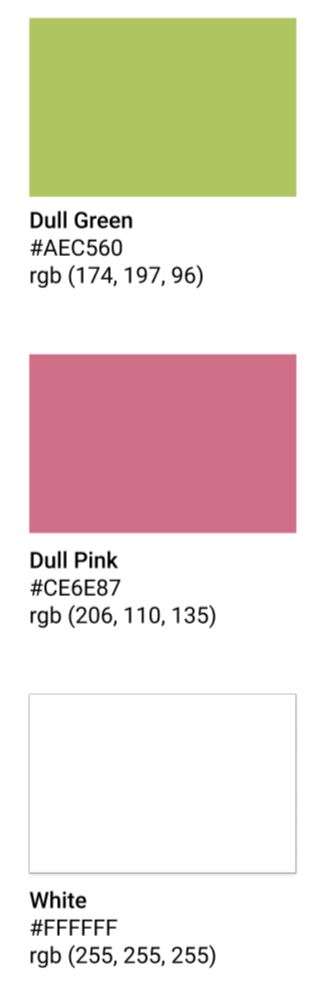
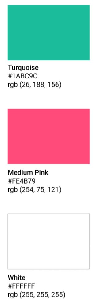
#2
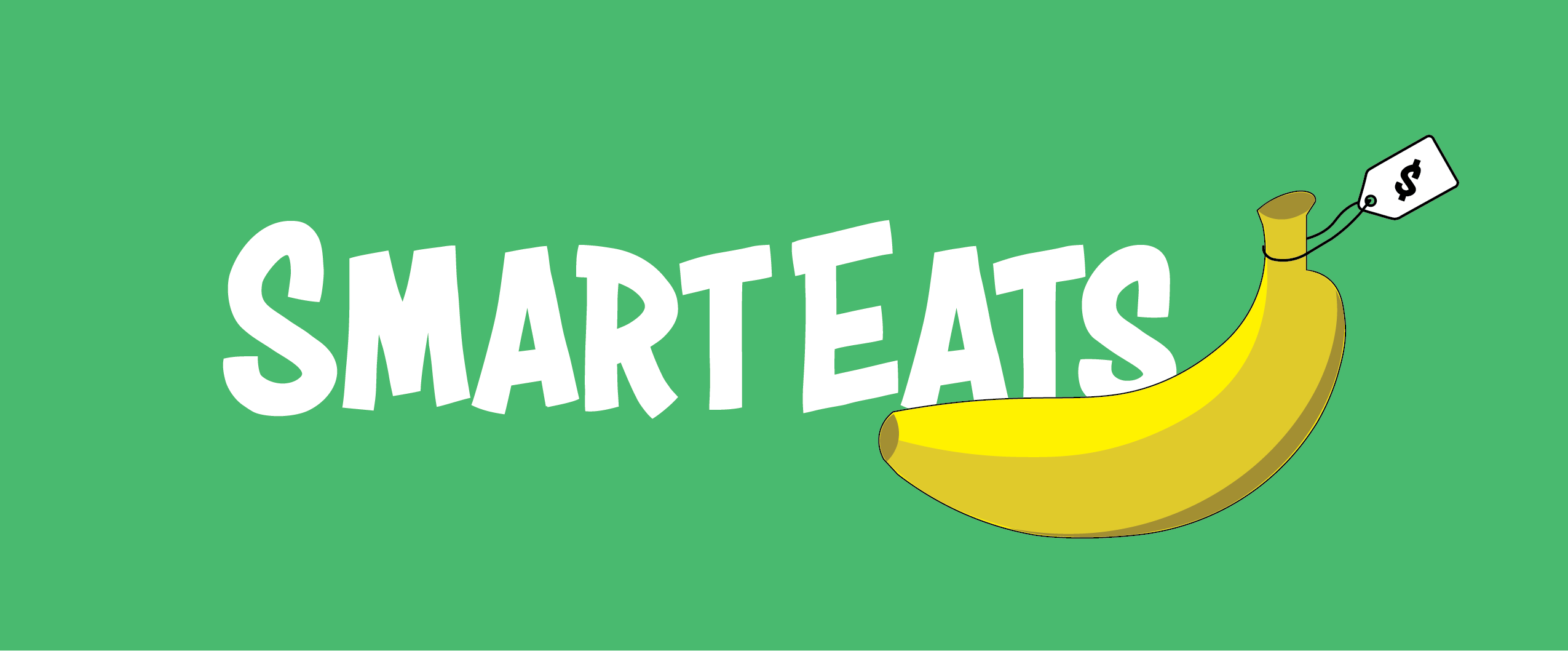
Feedback:
1. Color scheme could still be better - try something other than blues and greens
2. Logo still a problem
#2
Feedback:
1. Color scheme could still be better - try something other than blues and greens
2. Logo still a problem
#2
Feedback:
1. Color scheme could still be better - try something other than blues and greens
2. Logo still a problem
#2
Feedback:
1. Color scheme could still be better - try something other than blues and greens
2. Logo still a problem
#2
Feedback:
1. Color scheme could still be better - try something other than blues and greens
2. Logo still a problem
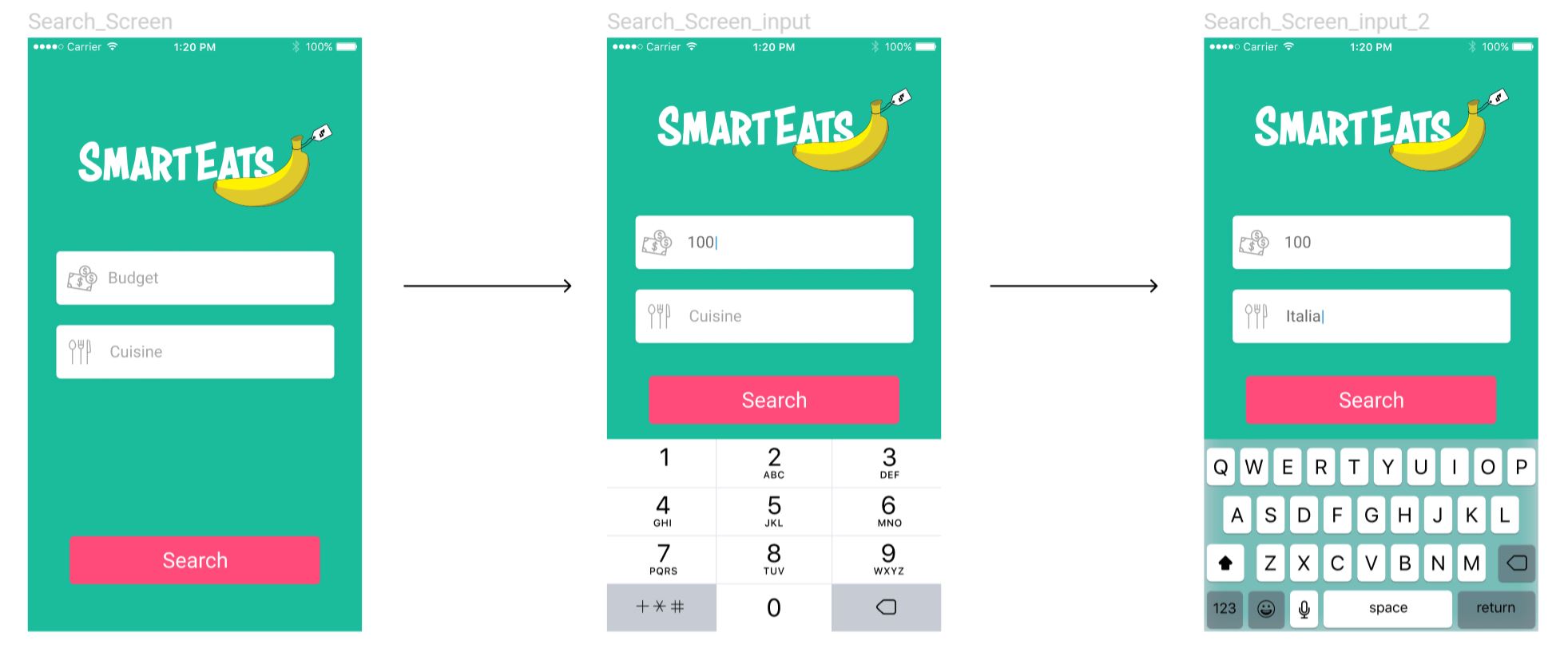
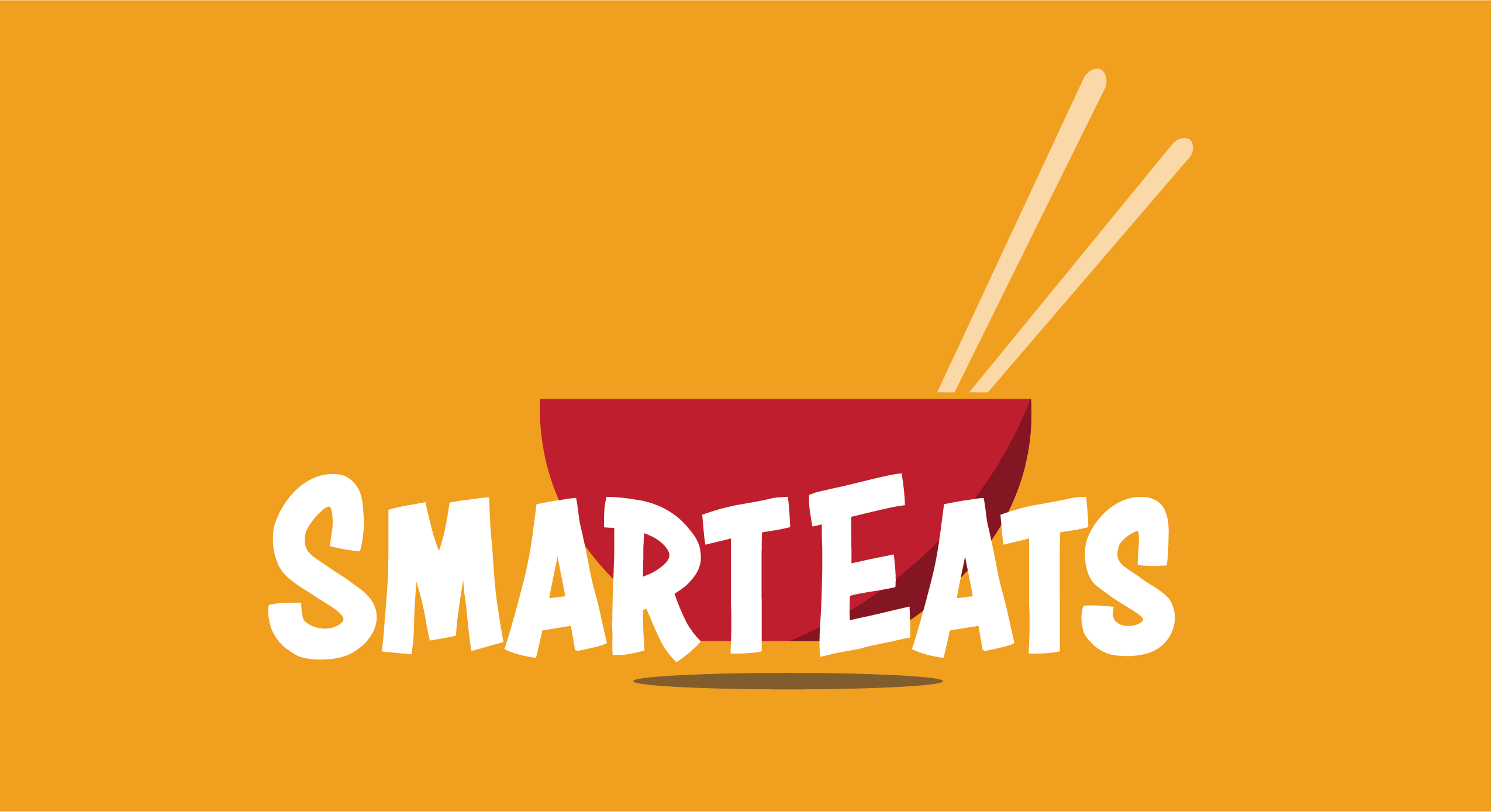
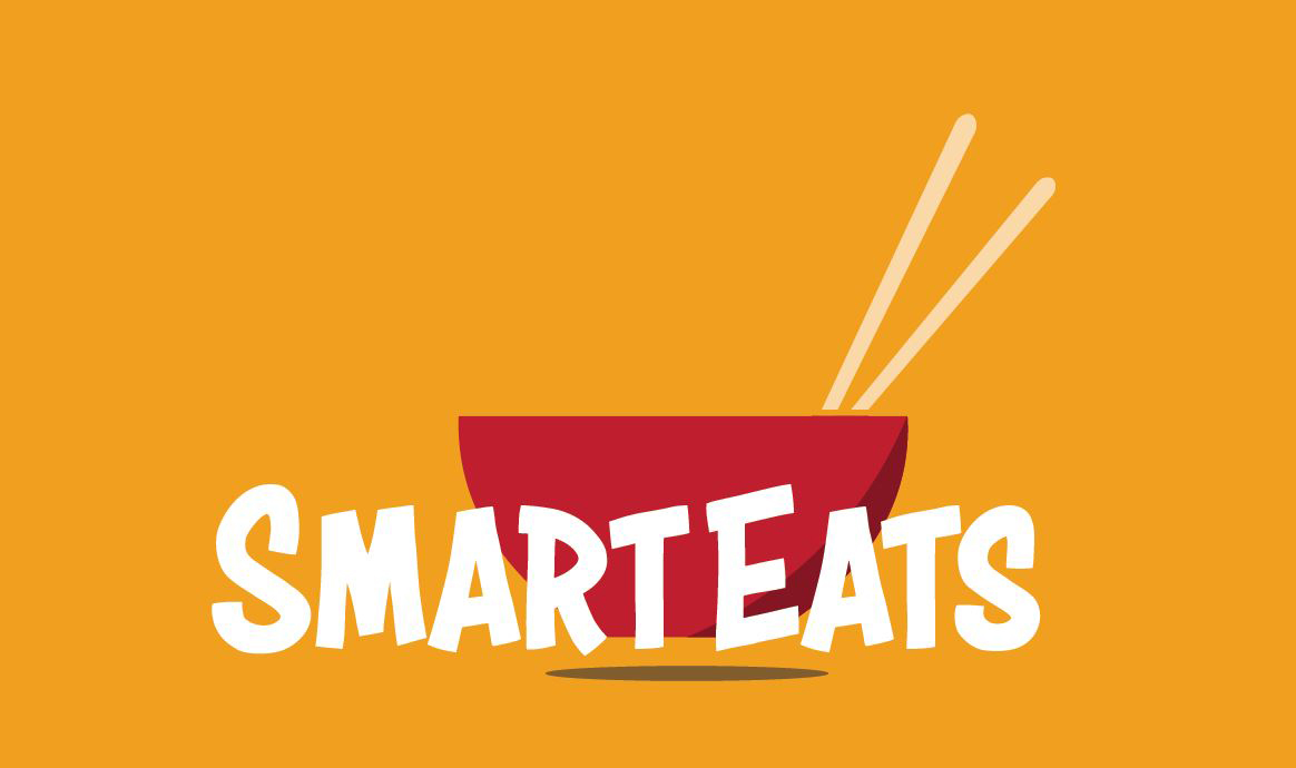
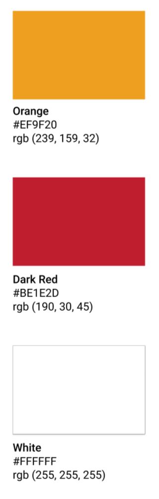
#3
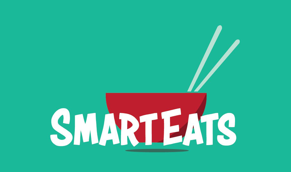
Feedback:
1. "The new color scheme really gives life to the app!"
2. "Switching the banana with the noodle bowl is a good touch. It makes more sense"
#3
Feedback:
1. "The new color scheme really gives life to the app!"
2. "Switching the banana with the noodle bowl is a good touch. It makes more sense"
#3
Feedback:
1. "The new color scheme really gives life to the app!"
2. "Switching the banana with the noodle bowl is a good touch. It makes more sense"
#3
Feedback:
1. "The new color scheme really gives life to the app!"
2. "Switching the banana with the noodle bowl is a good touch. It makes more sense"
#3
Feedback:
1. "The new color scheme really gives life to the app!"
2. "Switching the banana with the noodle bowl is a good touch. It makes more sense"
LOGO VARIATIONS


COLOR SCHEME VARIATIONS
DESIGNS
Want to try it out?
Zeerak Fayiz - Copyright 2022 ©