The Story
"Sila" is an Arabic word that means "connection".
Founded as an umbrella organization at NYU Abu Dhabi, Sila conferences are student-led initiatives involving students from universities in the region to come together and solve local issues.
Eventually, Sila Connection made its way to NYU Shanghai in the form of a sister organization. For the first conference, Sila Connection Shanghai chose to use the same branding as Sila Connection Abu Dhabi had been.
However, once the second conference came around, the Executive Board wanted a rebrand.
The Magic Potion
+
+
+
+
"联系" (liánxì)
or
Connection
"联系" (liánxì)
or
Connection
"联系" (liánxì)
or
Connection
"联系" (liánxì)
or
Connection
=
=
Thought Process:
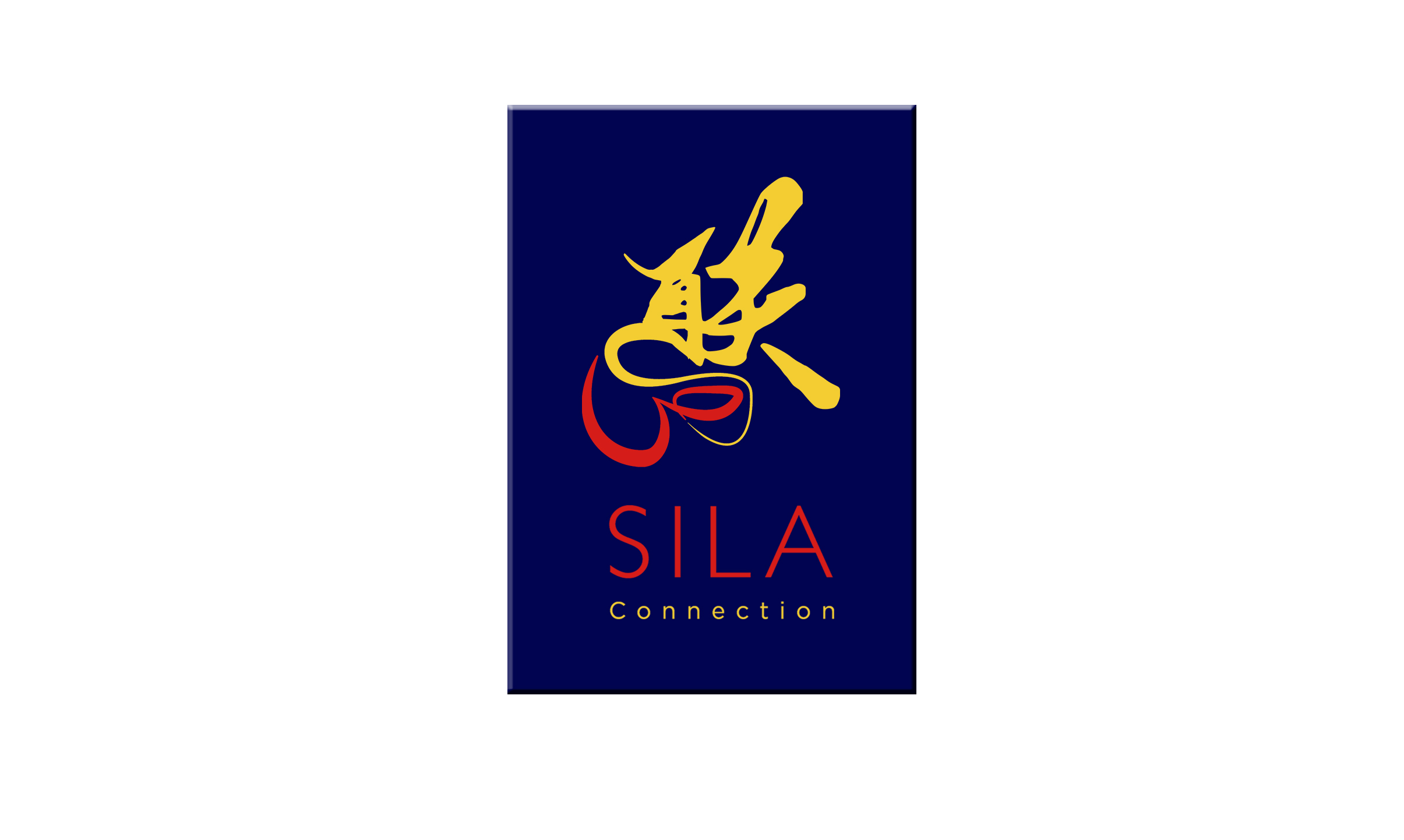
Coming up with a new logo for Sila Connection Shanghai, while not changing the vibe of the Sila Connection Abu Dhabi logo was tricky.
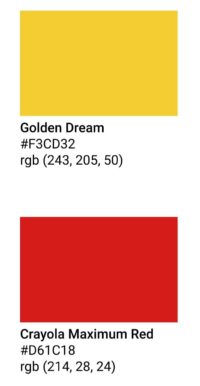
Naturally, my first thought was to incorporate something that reminded people of 'China'. One of the many ways I thought of doing this was by using the colors from the Chinese flag. They are not the exact same colors, but come close.
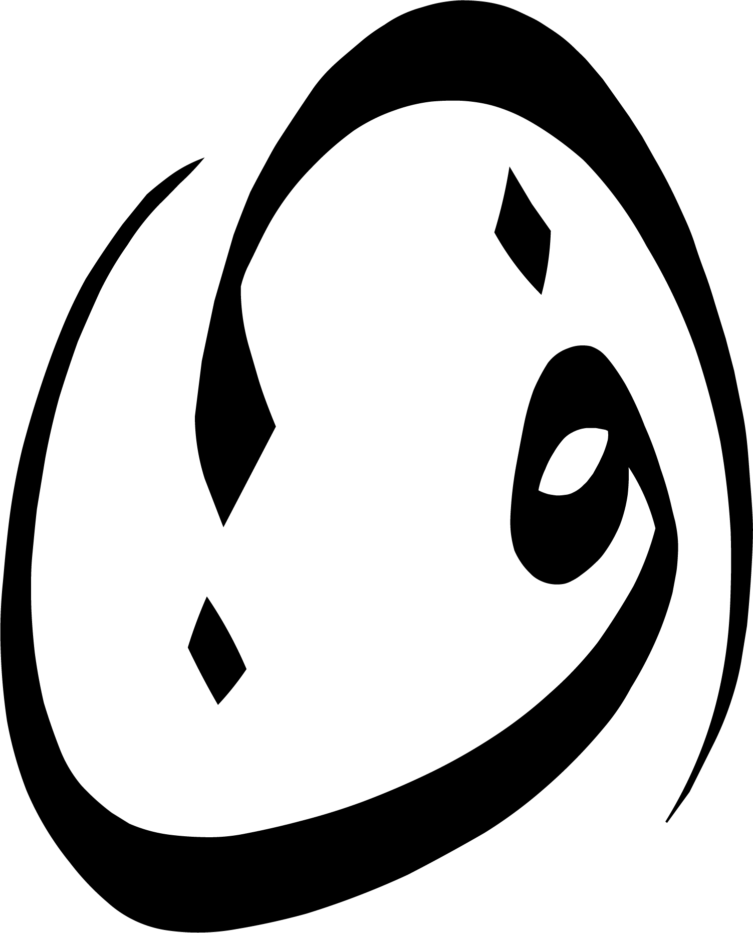
Moreover, I reflected on the meaning of the word "Sila" and pondered over how the original logo was made. Considering it is an Arabic word, the illustration makes use of the first letter of the word Sila, which is "ص" (Saad).
"联系" (liánxì) is the Chinese translation of the word "connection". Using the same logic, I used the first part of the word (联) and combined it with the original logo. Thus, making it easily recognizable as Sila Connection Shanghai.
Thought Process:
Coming up with a new logo for Sila Connection Shanghai, while not changing the vibe of the Sila Connection Abu Dhabi logo was tricky.
Naturally, my first thought was to incorporate something that reminded people of 'China'. One of the many ways I thought of doing this was by using the colors from the Chinese flag. They are not the exact same colors but come close.
Moreover, I reflected on the meaning of the word "Sila" and pondered over how the original logo was made. Considering it is an Arabic word, the illustration makes use of the first letter of the word Sila, which is "ص" (Saad).
"联系" (liánxì) is the Chinese translation of the word "connection". Using the same logic, I used the first part of the word (联) and combined it with the original logo. Thus, making it easily recognizable as Sila Connection Shanghai.
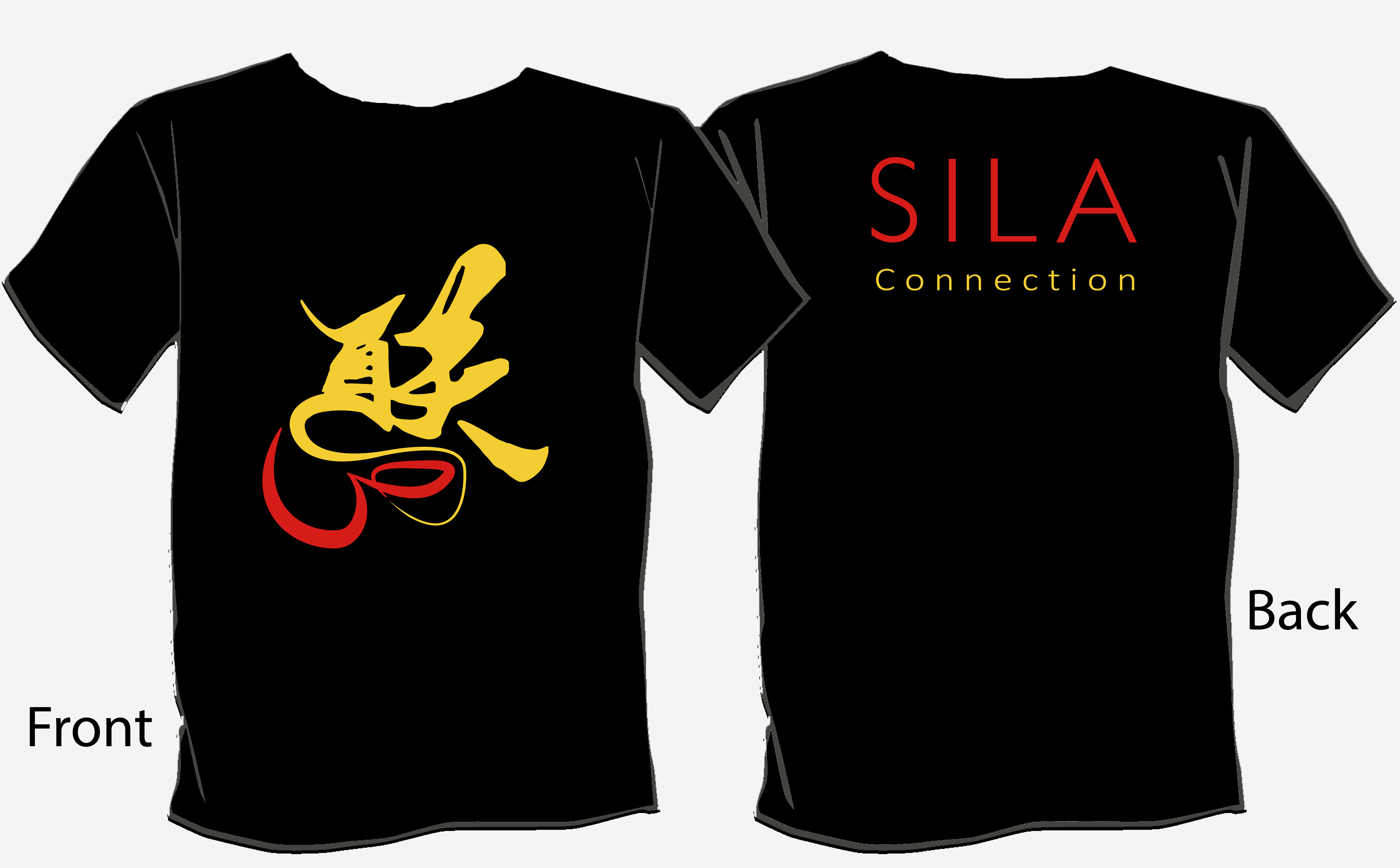
Designs
Designs
Zeerak Fayiz - Copyright 2022 ©