
NimbleRx is a free same-day delivery pharmacy currently based in California. Realizing how much patients dread making the trip to and standing in line at pharmacies, NimbleRx aims to make life easier for patients, and become the "most loved pharmacy in America".
As a design intern, I helped the lead designer with the Kiosk and iOS app, while also redesigning the internal Patient Advocate Dashboard.
Problem
The PA dashboard is used by patient advocates, to keep track of patients' data. Since NimbleRx initially lacked a UX/UI Designer, the current platform came with a lot of problems and inconsistencies.
Part of the complaint by the patient advocates was that they have trouble finding "where things are." Moreover, because of the sheer amount of improperly structured data, the patient advocates were not able to deliver quick and accurate answers to patients' questions.
Thus, a redesign was necessary.
Goal
The goal of the PA dashboard redesign was to make the process of handling patient questions and requests as fast and seamless as possible.
In short:
1. Adding more structure and transparency
2. Making it easier to navigate
3. Reducing redundant data
4. Making sure the redesign helps speed go up
Process
It all began with understanding the what, why, and how of the PA dashboard, followed by a lot of research into current design trends, with a special focus on data and table structuring, using sources such as Dribbble, Pinterest, etc.
Next came making low-fidelity designs with as little detail as a complex project like this could accommodate. Once there were around 5 iterations created, meetings with the PA team followed to get their feedback and point of view from a usage perspective.
Soon, one iteration was selected as the best, and hence, converted to high-fidelity.
Design Iterations
#1
Thoughts:
1. What if there is more than one order in progress?
2. Not too different from the current dashboard, so still overwhelming with data.
#1
Thoughts:
1. What if there is more than one order in progress?
2. Not too different from the current dashboard, so still overwhelming with data.
#1
Thoughts:
1. What if there is more than one order in progress?
2. Not too different from the current dashboard, so still overwhelming with data.
#1
Thoughts:
1. What if there is more than one order in progress?
2. Not too different from the current dashboard, so still overwhelming with data.
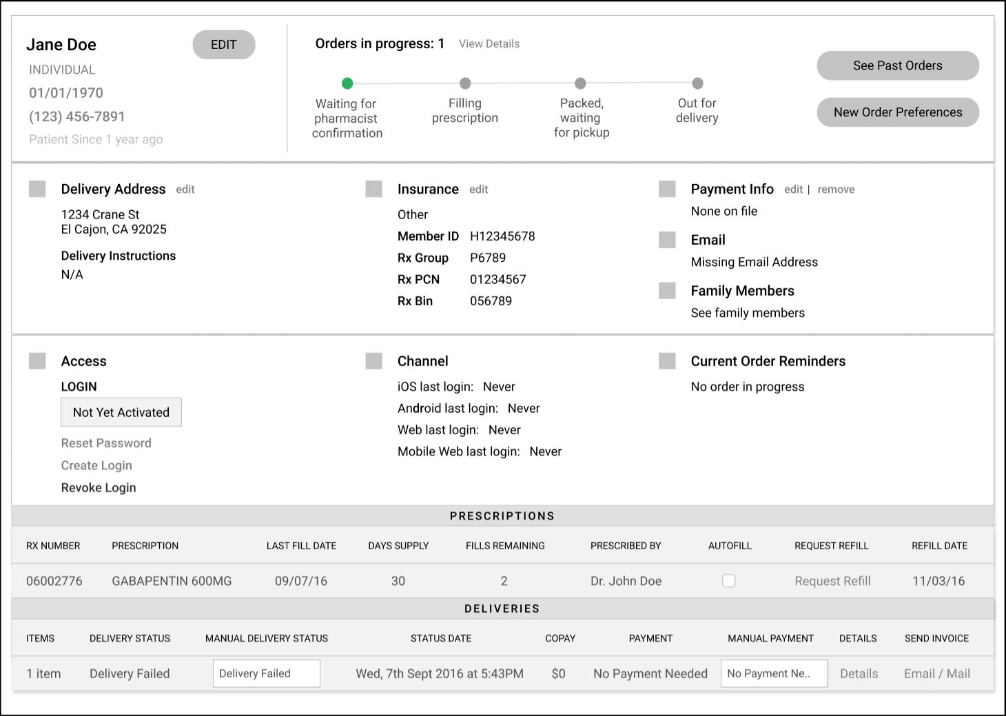
#2
Thoughts:
1. Solved the "orders in progress" issue.
2. How do we make this cleaner?
3. Is the deliveries table underneath even necessary?
4. What data can we scrape from this?
#2
Thoughts:
1. Solved the "orders in progress" issue.
2. How do we make this cleaner?
3. Is the deliveries table underneath even necessary?
4. What data can we scrape from this?
#2
Thoughts:
1. Solved the "orders in progress" issue.
2. How do we make this cleaner?
3. Is the deliveries table underneath even necessary?
4. What data can we scrape from this?
#2
Thoughts:
1. Solved the "orders in progress" issue.
2. How do we make this cleaner?
3. Is the deliveries table underneath even necessary?
4. What data can we scrape from this?
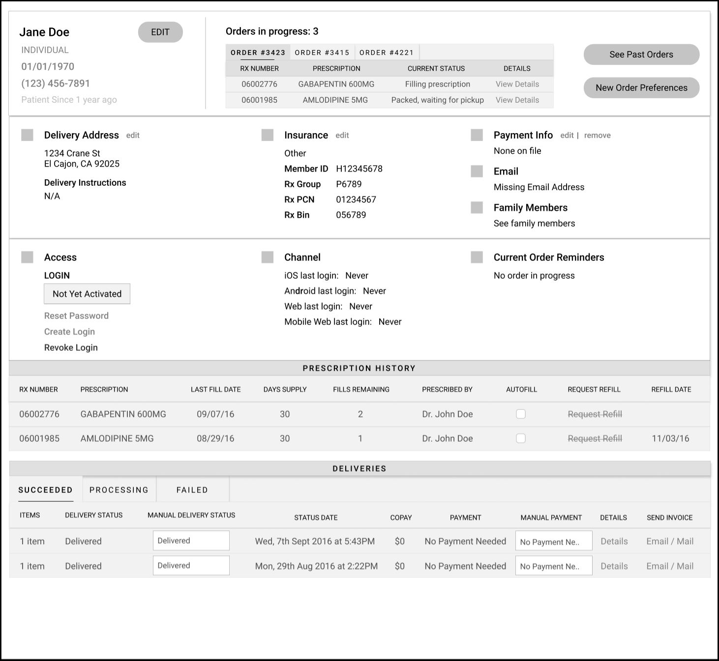
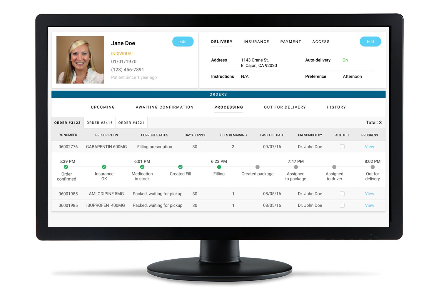
#3
Thoughts:
1. Cleaner interface.
2. Less overwhelming while accommodating the same amount of data.
3. More structured and transparent.
4. Addition of picture may increase empathy the advocates have for the patient.
#3
Thoughts:
1. Cleaner interface.
2. Less overwhelming while accommodating the same amount of data.
3. More structured and transparent.
4. Addition of picture may increase empathy the advocates have for the patient.
#3
Thoughts:
1. Cleaner interface.
2. Less overwhelming while accommodating the same amount of data.
3. More structured and transparent.
4. Addition of picture may increase empathy the advocates have for the patient.
#3
Thoughts:
1. Cleaner interface.
2. Less overwhelming while accommodating the same amount of data.
3. More structured and transparent.
4. Addition of picture may increase empathy the advocates have for the patient.
#3
Thoughts:
1. Cleaner interface.
2. Less overwhelming while accommodating the same amount of data.
3. More structured and transparent.
4. Addition of picture may increase empathy the advocates have for the patient.
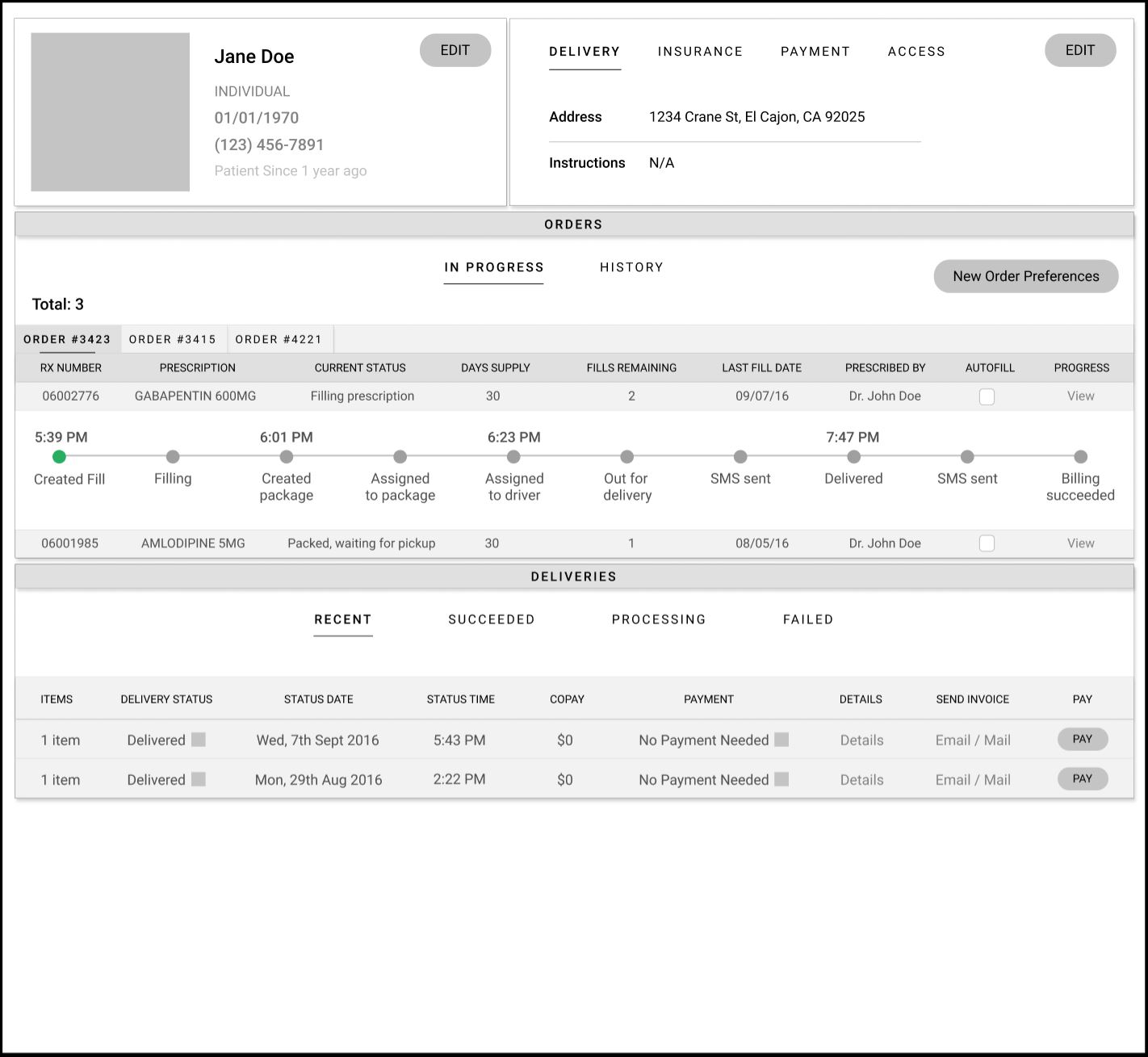
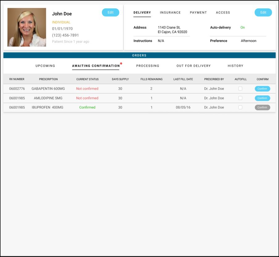
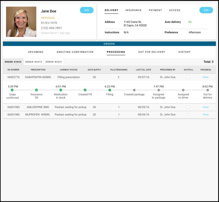
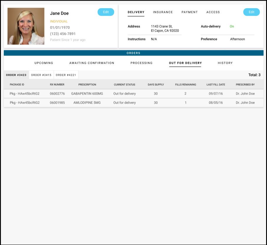
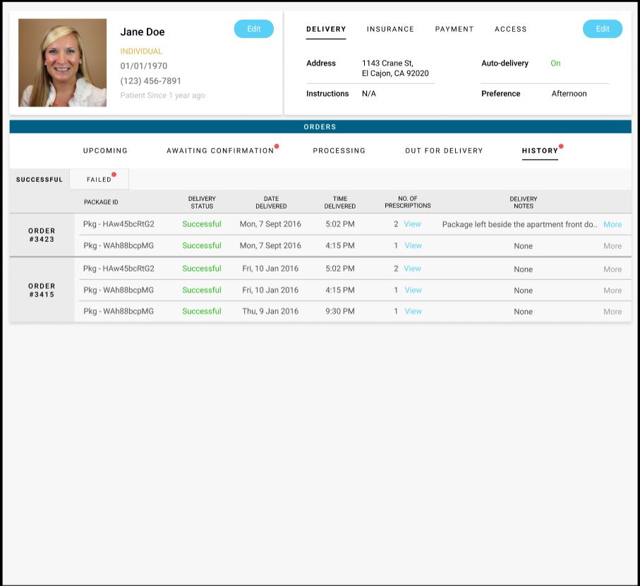
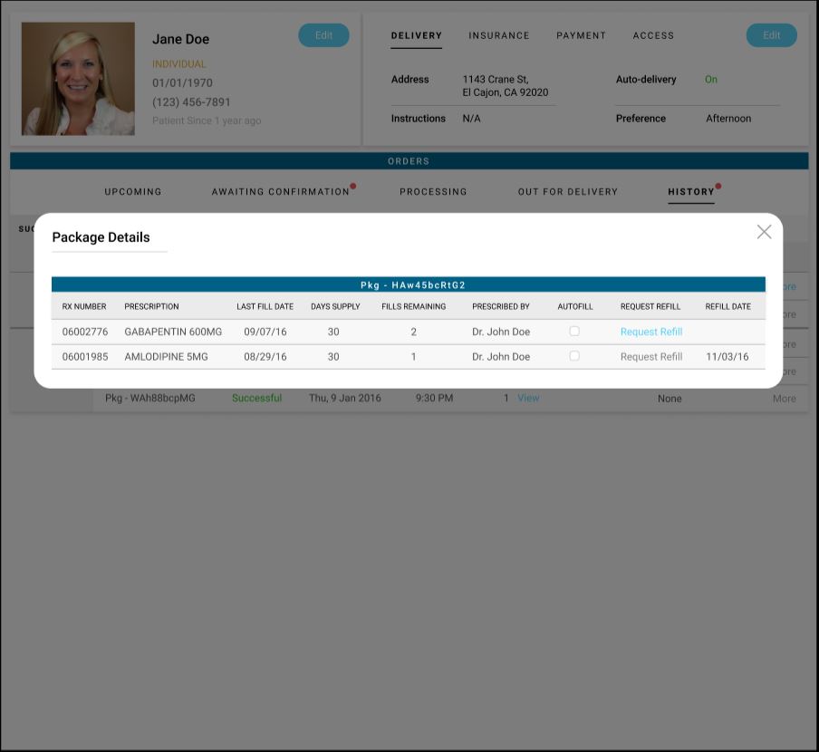
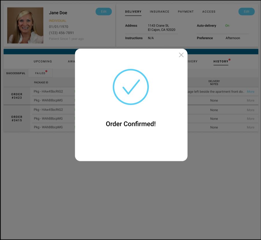
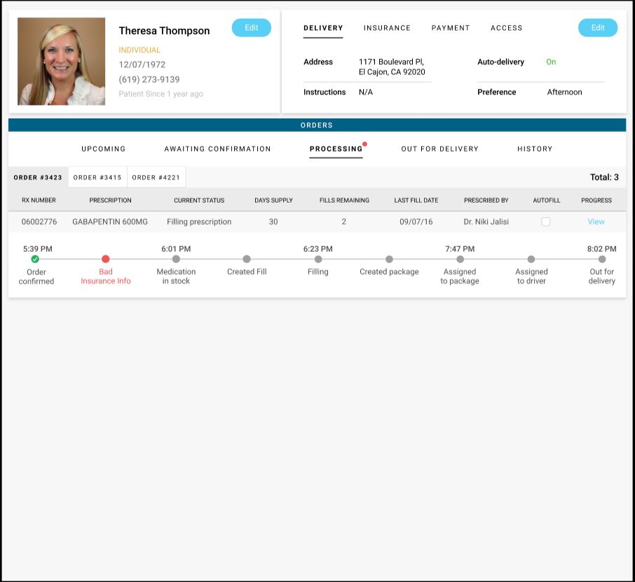
The Final Product

Zeerak Fayiz - Copyright 2022 ©