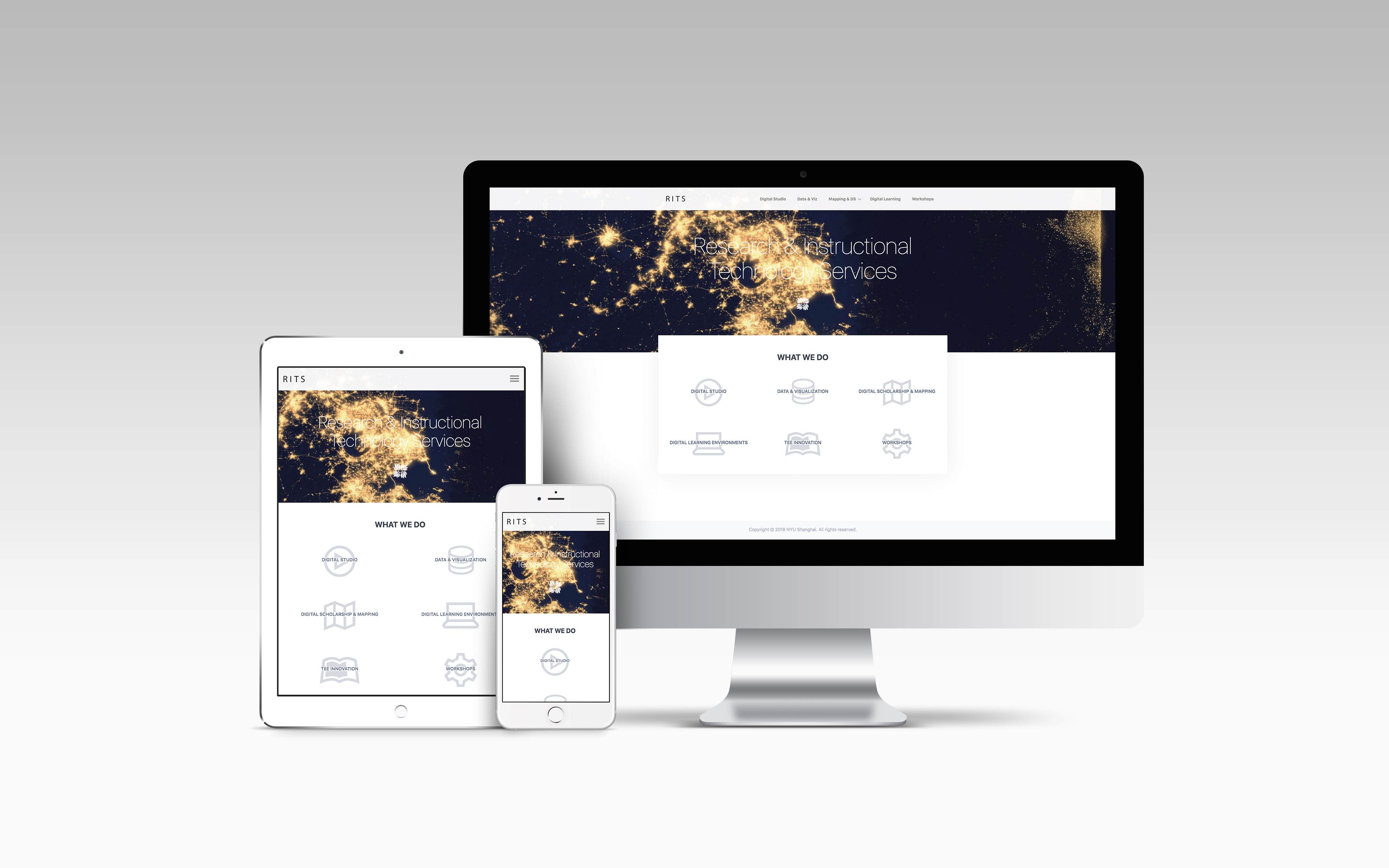
Research and Instructional Technology Services (RITS) is a sub-division within the Library at NYU Shanghai. It provides comprehensive instructional technology support for faculty and students, including consultation on instructional technology and design, web and mapping technologies, Learning Management System support, digital media production, and project management.
Research and Instructional Technology Services (RITS) is a sub-division within the Library at NYU Shanghai. It provides comprehensive instructional technology support for faculty and students, including consultation on instructional technology and design, web and mapping technologies, Learning Management System support, digital media production, and project management.
Research and Instructional Technology Services (RITS) is a sub-division within the Library at NYU Shanghai. It provides comprehensive instructional technology support for faculty and students, including consultation on instructional technology and design, web and mapping technologies, Learning Management System support, digital media production, and project management.
Research and Instructional Technology Services (RITS) is a sub-division within the Library at NYU Shanghai. It provides comprehensive instructional technology support for faculty and students, including consultation on instructional technology and design, web and mapping technologies, Learning Management System support, digital media production, and project management.
Research and Instructional Technology Services (RITS) is a sub-division within the Library at NYU Shanghai. It provides comprehensive instructional technology support for faculty and students, including consultation on instructional technology and design, web and mapping technologies, Learning Management System support, digital media production, and project management.
PROBLEM
Even though RITS is a part of the ever-busy library at NYU Shanghai, a large number of people don’t know it exists. This in part was due to a lack of internal marketing, but also because the limited marketing attempts were rendered less successful by the previous website -- it was swamped with (sometimes unnecessary) information regarding projects and services while lacking good information architecture. In short, a combo of the two made RITS' and its offerings hard for people to understand.
PROBLEM
Even though RITS is a part of the ever busy library at NYU Shanghai, a large number of people don’t know it exists. This in part was due to a lack of internal marketing, but also because the limited marketing attempts were rendered less successful by the previous website -- it was swamped with (sometimes unnecessary) information regarding projects and services while lacking good information architecture. In short, a combo of the two made RITS' and its offerings hard for people to understand.
GOAL
The goal of this project was to create a modern and simple website for RITS that could be used for raising awareness about their services at NYU Shanghai, while keeping ease of understanding and use at the center. Successfully being able to address the majority of the problems faced by users of the previous website first, followed by an improvement in awareness of RITS and its services were the defined metrics for success in this project.
PROCESS
The problems and goals of the project had been identified by the stakeholders and brought to my attention during our initial meetings. Asking questions such as "What is the purpose of this website?", "Who will use it?" and "What is the problem we are trying to solve?" allowed me to empathize and get an overall, surface-level picture for the project. However, that was not enough. Soon after, I put together all the information I had gathered and used the 'Design Thinking' methodology to visualize the task at hand.
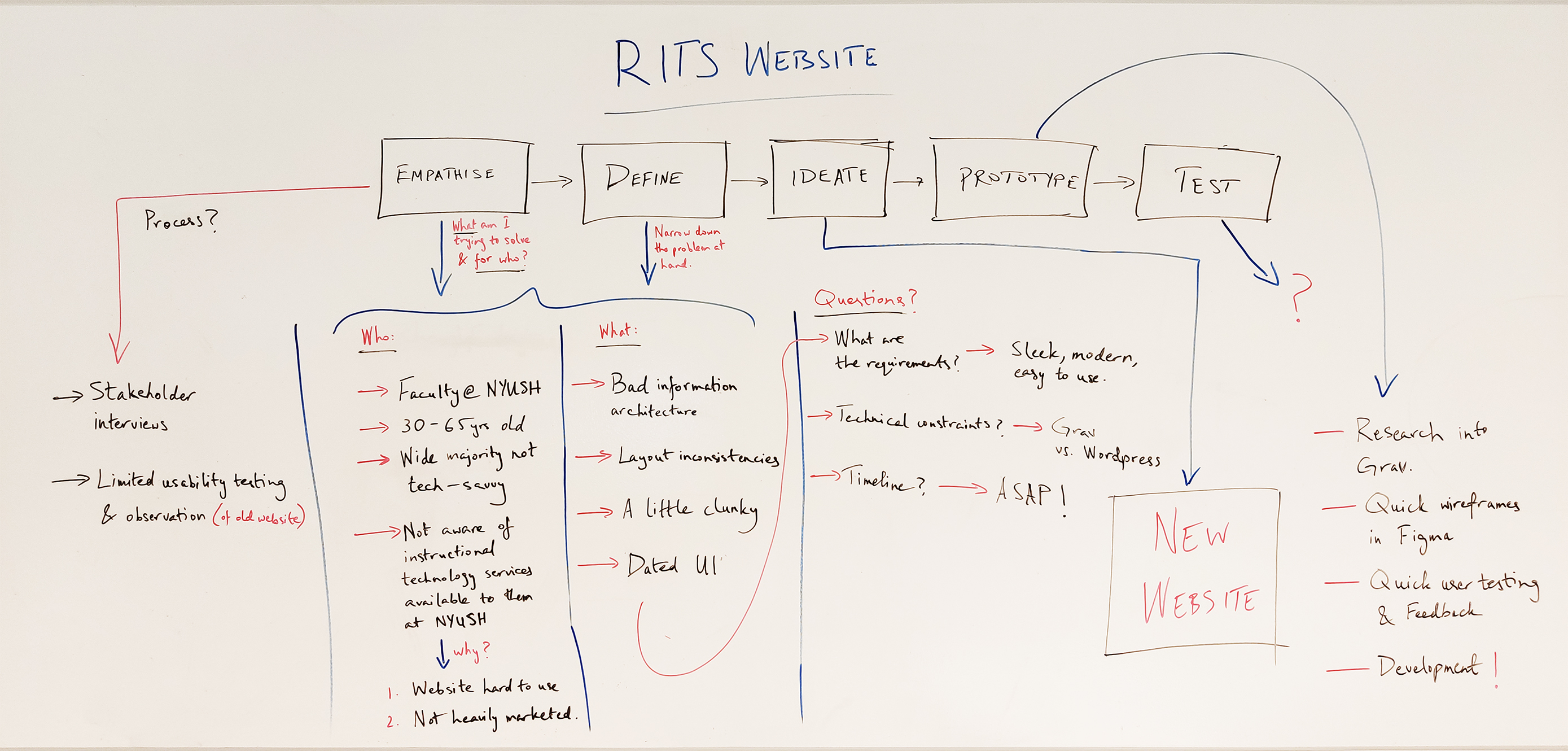
Initial overview + planning using design thinking methodology
Initial overview + planning using design thinking methodology
Initial overview + planning using design thinking methodology
Initial overview + planning using design thinking methodology
Initial overview + planning using design thinking methodology
USER PERSONA
USER PERSONA
USER PERSONA
USER PERSONA
EMPATHIZE
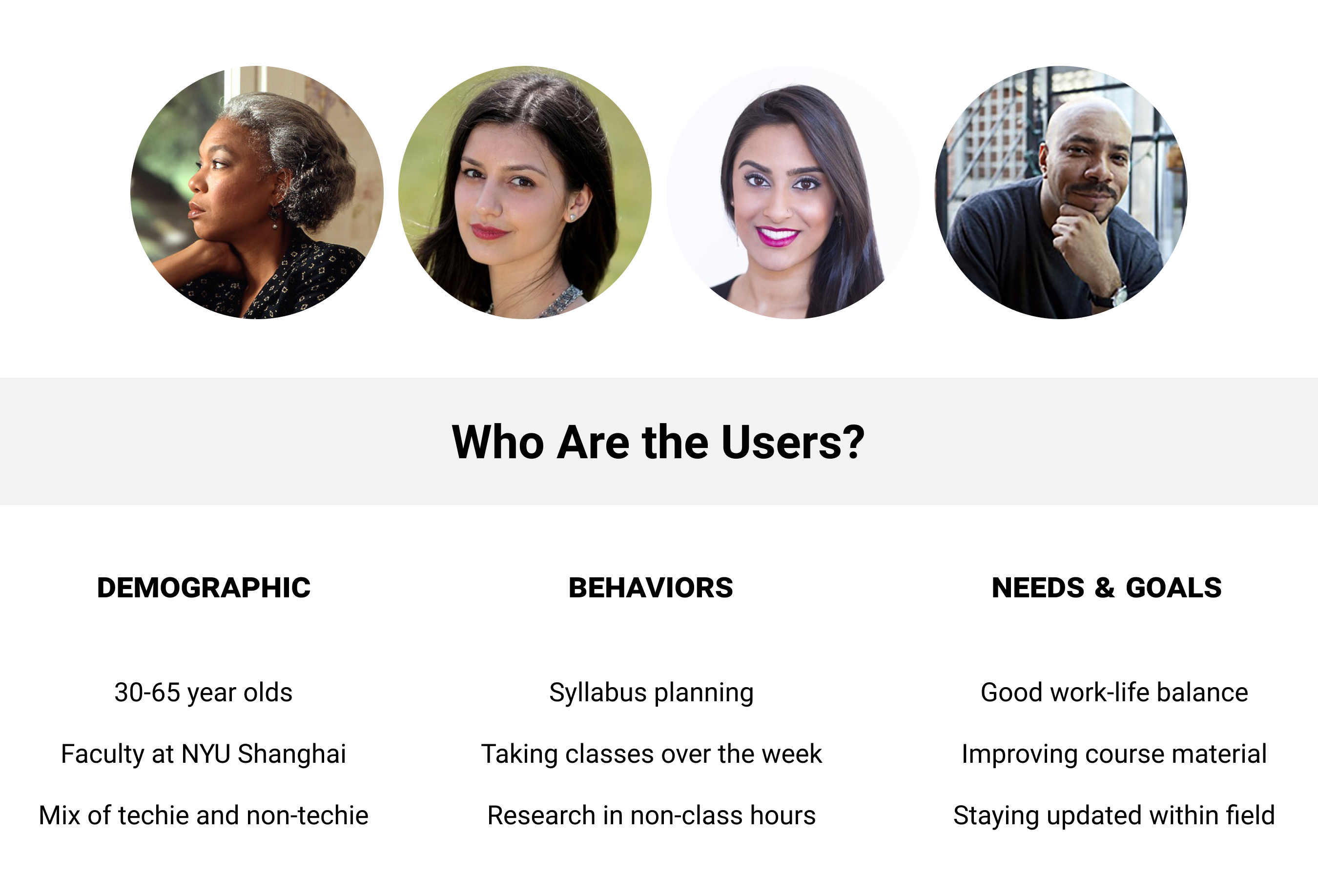
At this stage, I had successfully identified our target audience -- the vast majority of them were faculty at NYU Shanghai between the ages of 30 and 65. Additionally, they were a blend of tech-savvy and non-tech savvy -- the younger faculty seemed to be more comfortable with the web and other technologies. As such, to accommodate both ends of the spectrum, we decided to make the website as simple to use as possible.
EMPATHIZE
At this stage, I had successfully identified our target audience -- the vast majority of them were faculty at NYU Shanghai between the ages of 30 and 65. Additionally, they were a blend of tech-savvy and non-tech-savvy -- the younger faculty seemed to be more comfortable with the web and other technologies. As such, to accommodate both ends of the spectrum, we decided to make the website as simple to use as possible.
EMPATHIZE
At this stage, I had successfully identified our target audience -- the vast majority of them were faculty at NYU Shanghai between the ages of 30 and 65. Additionally, they were a blend of tech-savvy and non-tech savvy -- the younger faculty seemed to be more comfortable with the web and other technologies. As such, to accommodate both ends of the spectrum, we decided to make the website as simple to use as possible.
DEFINE
Now that the audience had been empathized with, it was time to point out the problems that they were encountering with the previous website. My assumptions of: "bad information architecture", "confusing site map", followed by the "dated UI", were rendered true once I conducted usability testing and user interviews.
The takeaway -- moving forward, consistency and clarity should be the main focus.
DEFINE
Now that the audience had been empathized with, it was time to point out the problems that these 'users' were encountering with the previous website. My assumptions of: "bad information architecture", "layout inconsistencies", followed by the "dated and clunky UI", were rendered true once I conducted usability testing and user interviews. Moving forward, consistency and clarity was the main focus.
DEFINE
Now that the audience had been empathized with, it was time to point out the problems that they were encountering with the previous website. My assumptions of: "bad information architecture", "confusing site map", followed by the "dated UI", were rendered true once I conducted usability testing and user interviews.
The takeaway -- moving forward, consistency and clarity should be the main focus.
DEFINE
Now that the audience had been empathized with, it was time to point out the problems that they were encountering with the previous website. My assumptions of: "bad information architecture", "confusing site map", followed by the "dated UI", were rendered true once I conducted usability testing and user interviews.
The takeaway -- moving forward, consistency and clarity should be the main focus.
OVERCOME?
Followed by the user interviews, I went ahead and quickly carved out low-fidelity mockups, keeping in mind the technical and time constraints. Once they were done, I sat down with the stakeholders to share my findings and design proposals. On approval, I got to building the actual website -- at the time, we decided it was best to build the product rather than keep wireframing and testing, mainly because I was a one-man army. We continued user testing once we had a stable build live.
ITERATIONS
ITERATIONS
ITERATIONS
#1
Feedback:
1. A little outdated and boxy visually.
2. It doesn't really clarify what RITS is upfront.
#1
Feedback:
1. A little outdated and boxy visually.
2. It doesn't really clarify what RITS is upfront.
#1
Feedback:
1. A little outdated and boxy visually.
2. It doesn't really clarify what RITS is upfront.
#1
Feedback:
1. A little outdated and boxy visually.
2. It doesn't really clarify what RITS is upfront.
#1
Feedback:
1. A little outdated and boxy visually.
2. It doesn't really clarify what RITS is upfront.
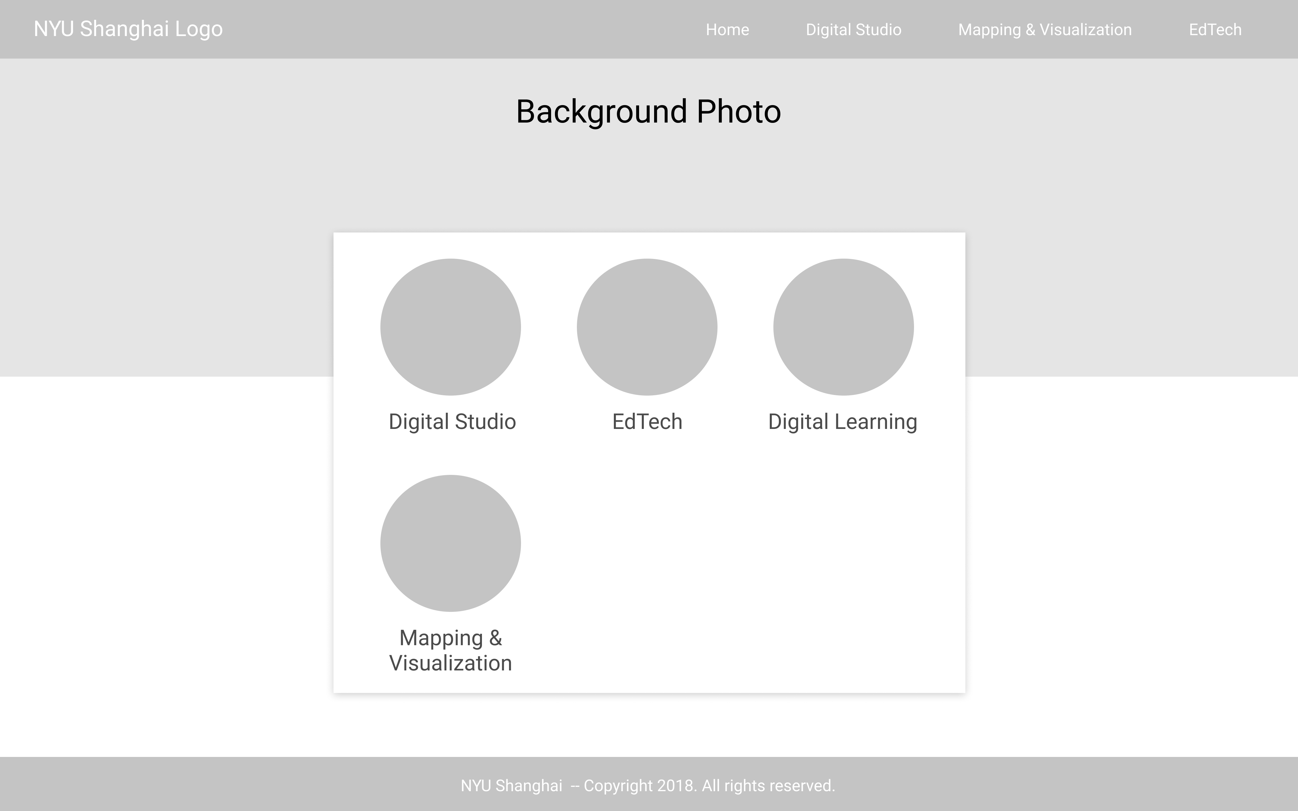
#2
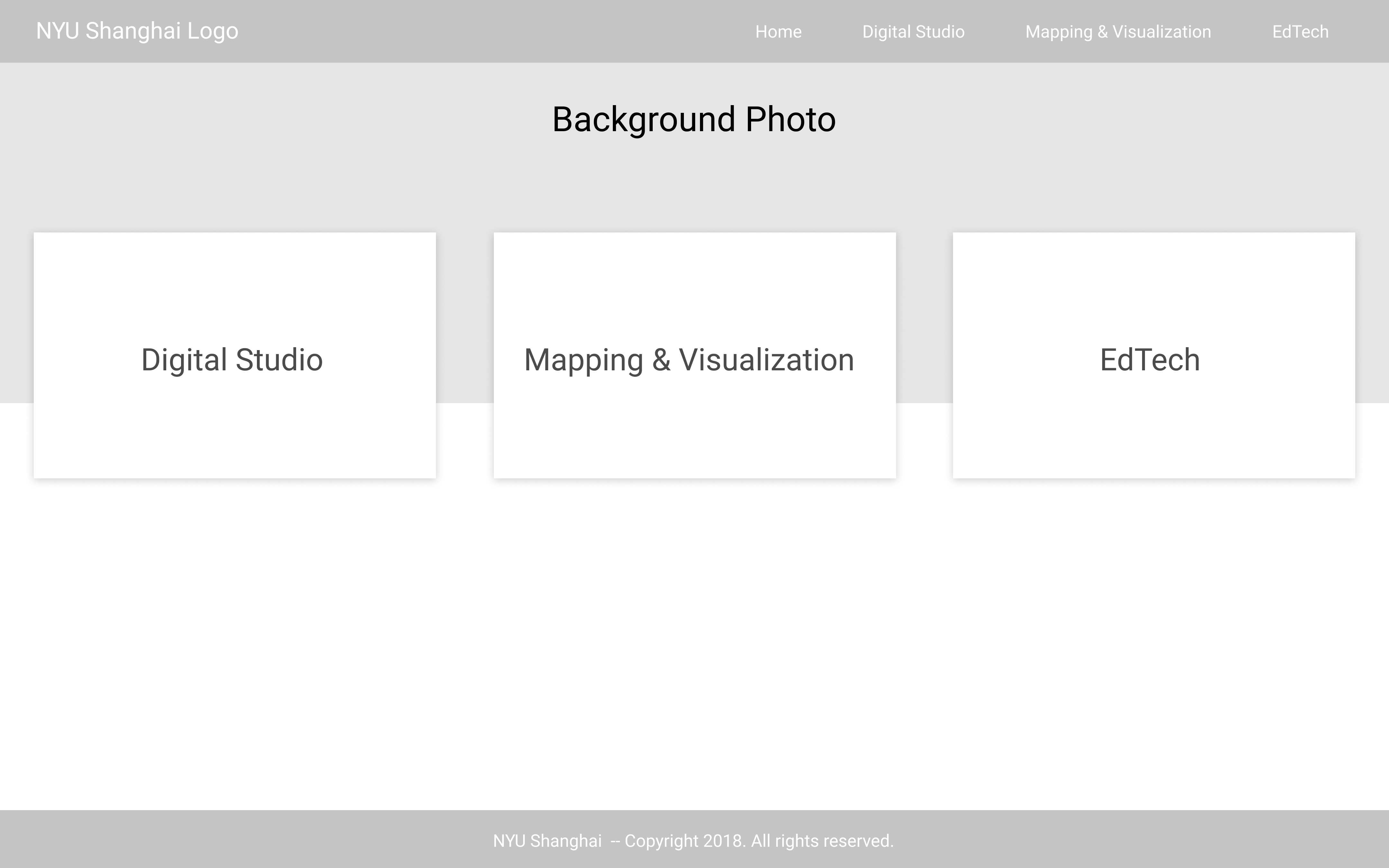
Feedback:
1. Liked the layout overall -- simple yet different.
2. Maybe the text isn't THAT necessary.
3. There's a lot going on here to make sense of for someone not tech-savvy.
#2
Feedback:
1. Liked the layout overall -- simple yet different.
2. Maybe the text isn't THAT necessary.
3. There's a lot going on here to make sense of for someone not tech-savvy.
#2
Feedback:
1. Liked the layout overall -- simple yet different.
2. Maybe the text isn't THAT necessary.
3. There's a lot going on here to make sense of for someone not tech-savvy.
#2
Feedback:
1. Liked the layout overall -- simple yet different.
2. Maybe the text isn't THAT necessary.
3. There's a lot going on here to make sense of for someone not tech-savvy.
#2
Feedback:
1. Liked the layout overall -- simple yet different.
2. Maybe the text isn't THAT necessary.
3. There's a lot going on here to make sense of for someone not tech-savvy.
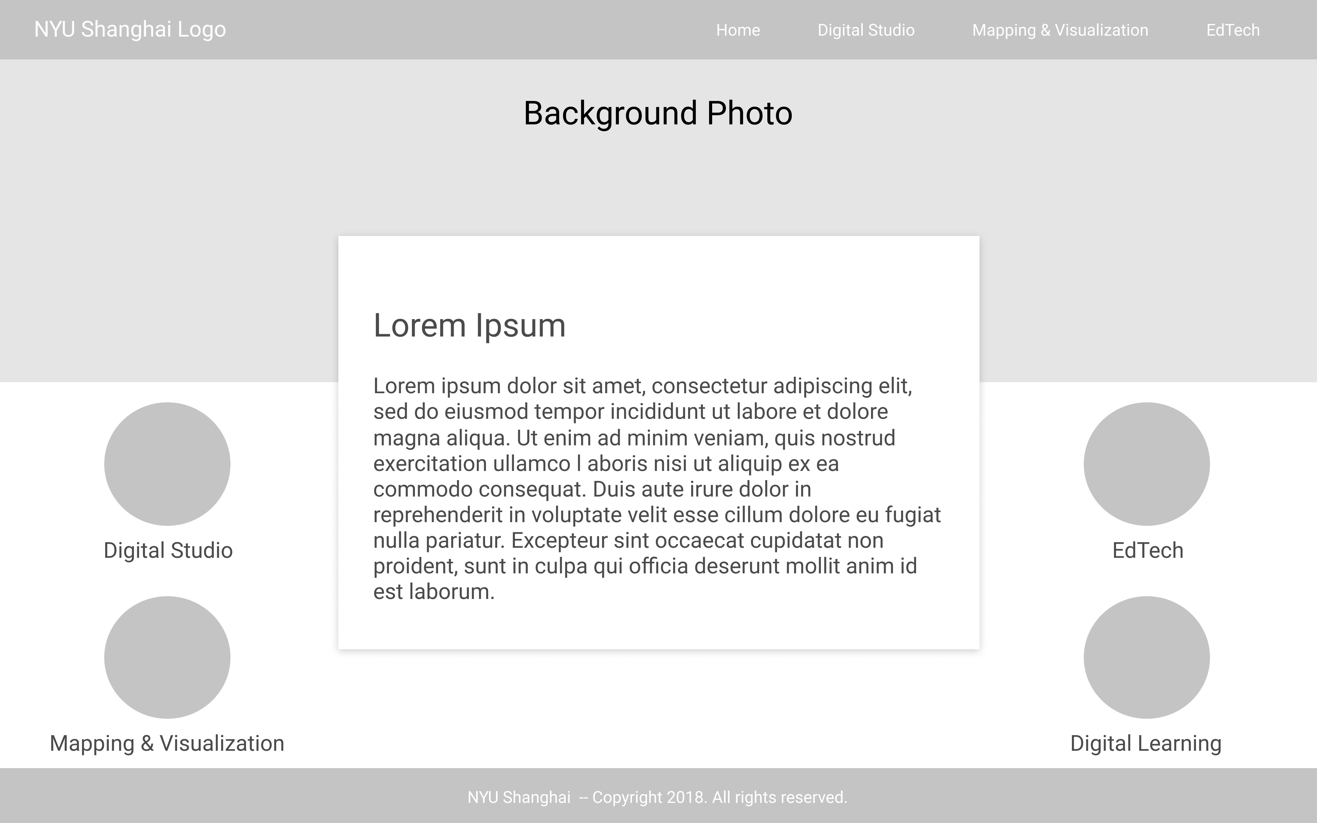
#3
Feedback:
1. Mixes elements from the 1st and 2nd iterations -- works well!
2. Less overwhelming and visually appealing.
3. The use of iconography should be able to mitigate the need for intro text.
#3
Feedback:
1. Mixes elements from the 1st and 2nd iterations -- works well!
2. Less overwhelming and visually appealing.
3. The use of iconography should be able to mitigate the need for intro text.
#3
Feedback:
1. Mixes elements from the 1st and 2nd iterations -- works well!
2. Less overwhelming and visually appealing.
3. The use of iconography should be able to mitigate the need for intro text.
#3
Feedback:
1. Mixes elements from the 1st and 2nd iterations -- works well!
2. Less overwhelming and visually appealing.
3. The use of iconography should be able to mitigate the need for intro text.
#3
Feedback:
1. Mixes elements from the 1st and 2nd iterations -- works well!
2. Less overwhelming and visually appealing.
3. The use of iconography should be able to mitigate the need for intro text.
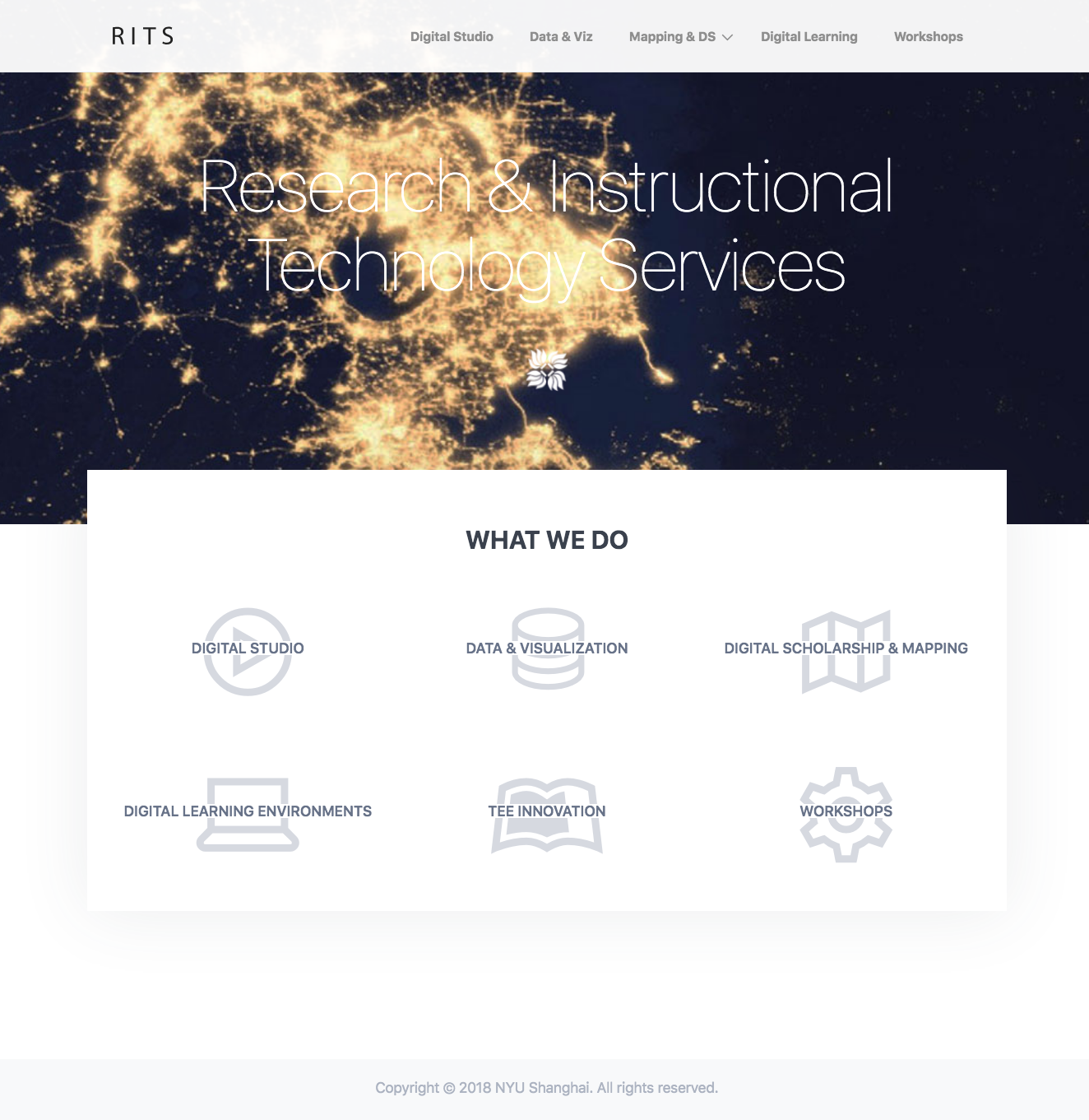
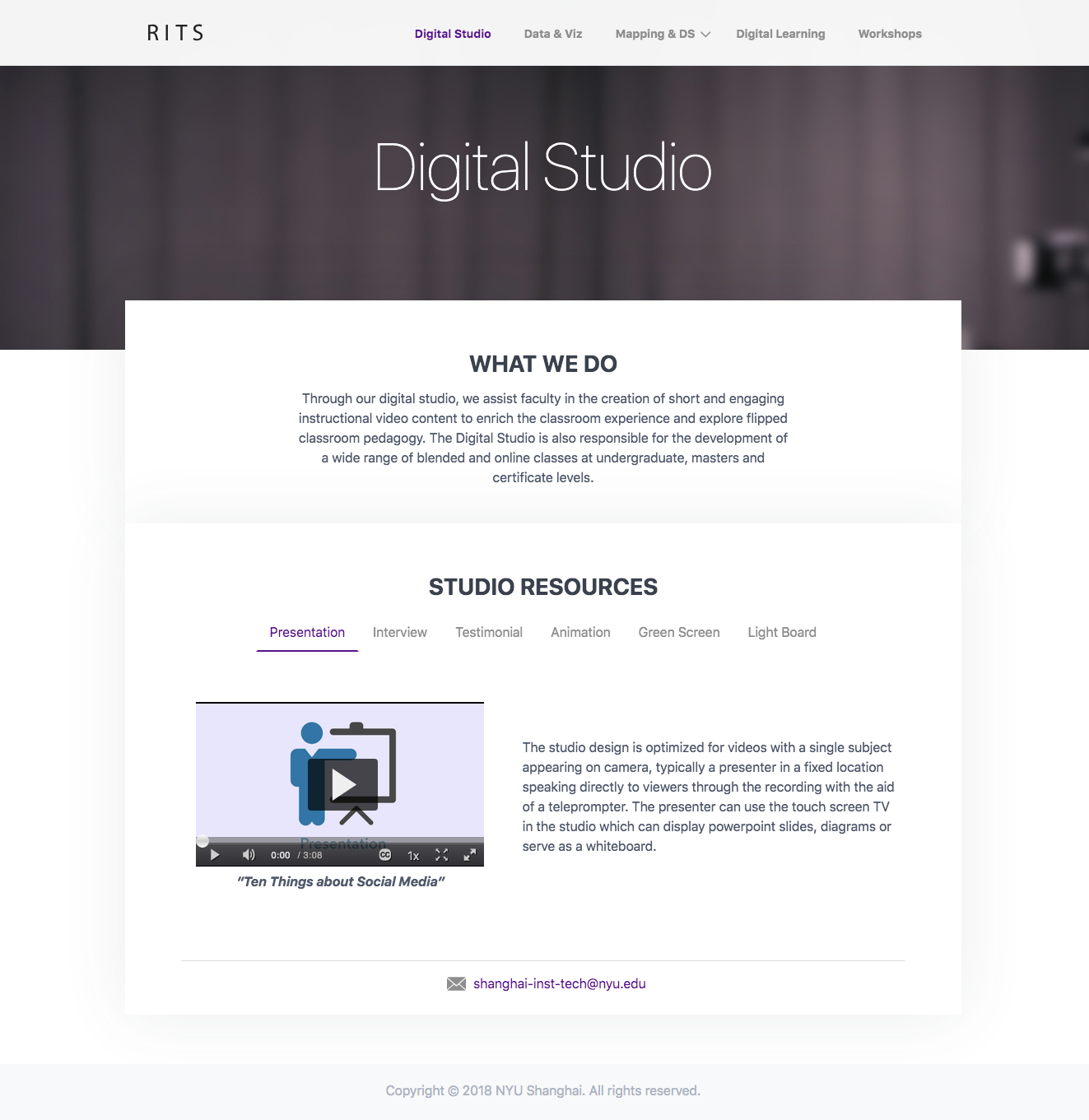
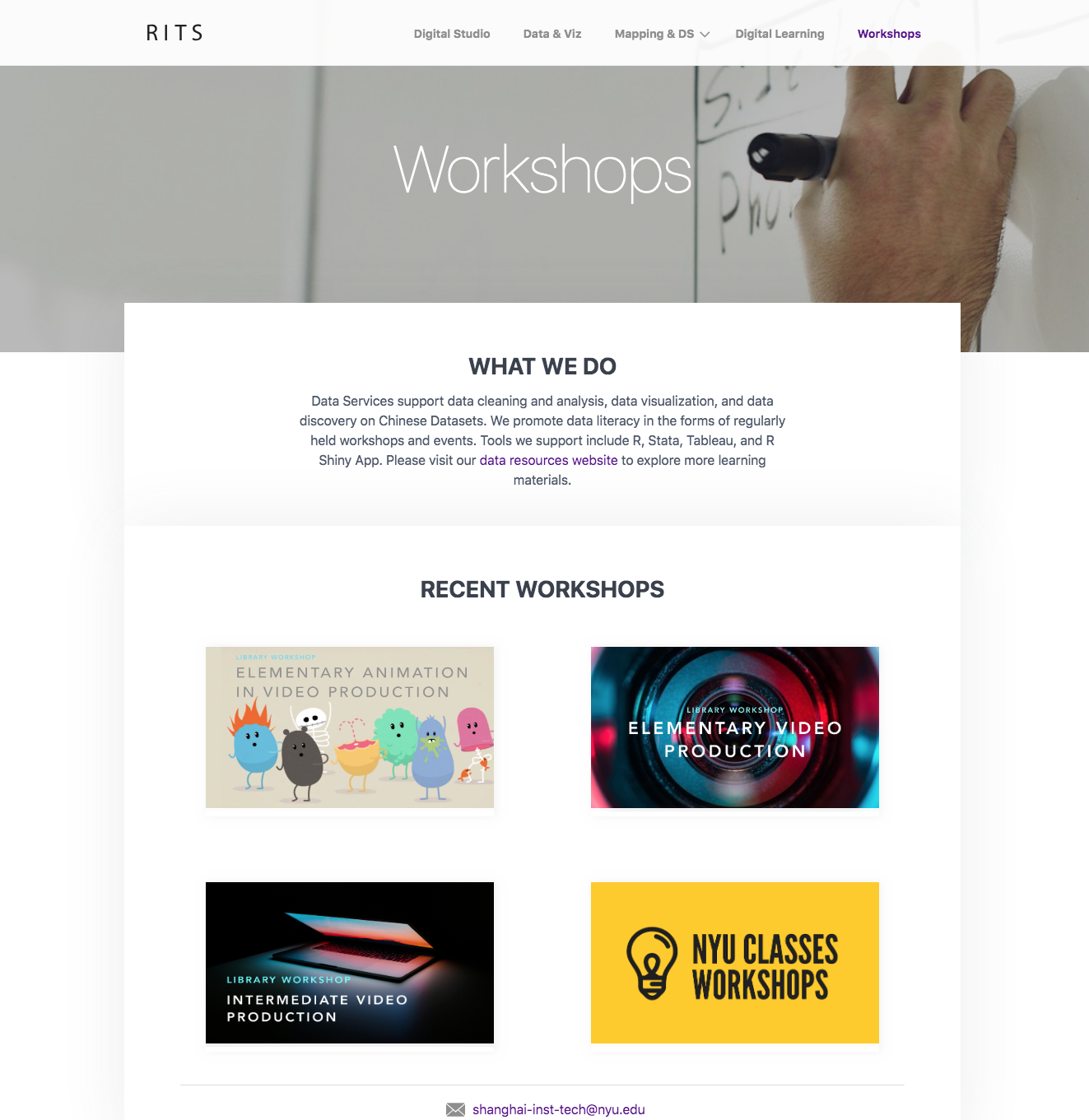
FINAL LOOK
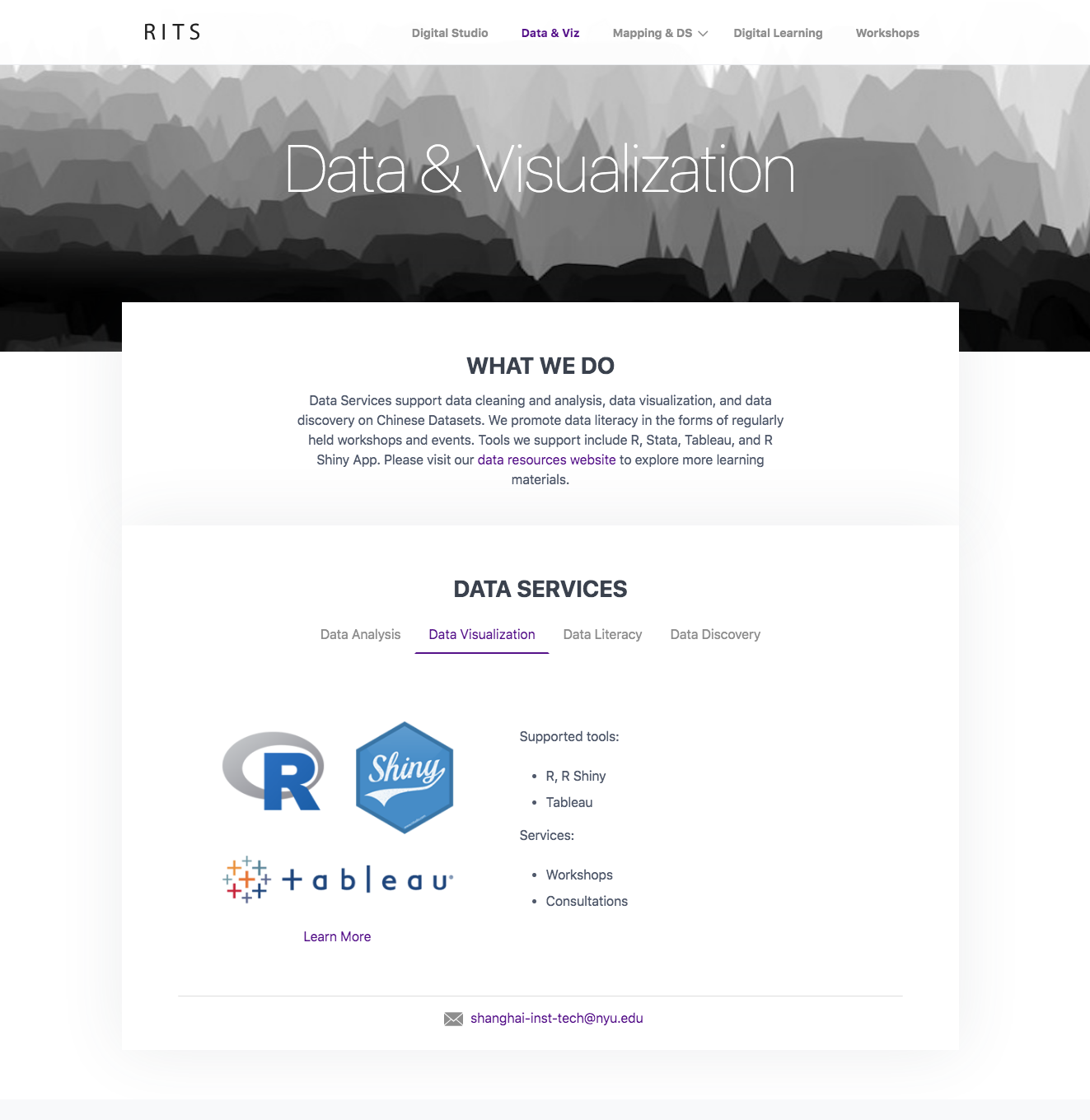
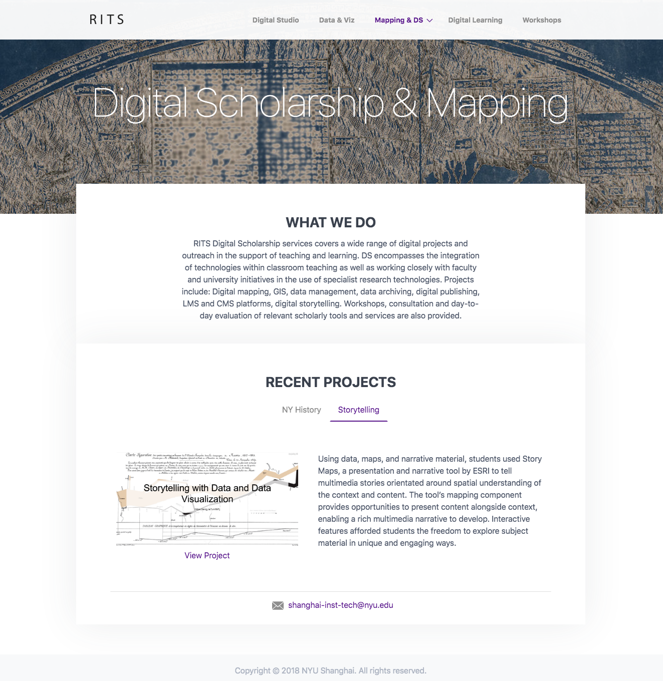
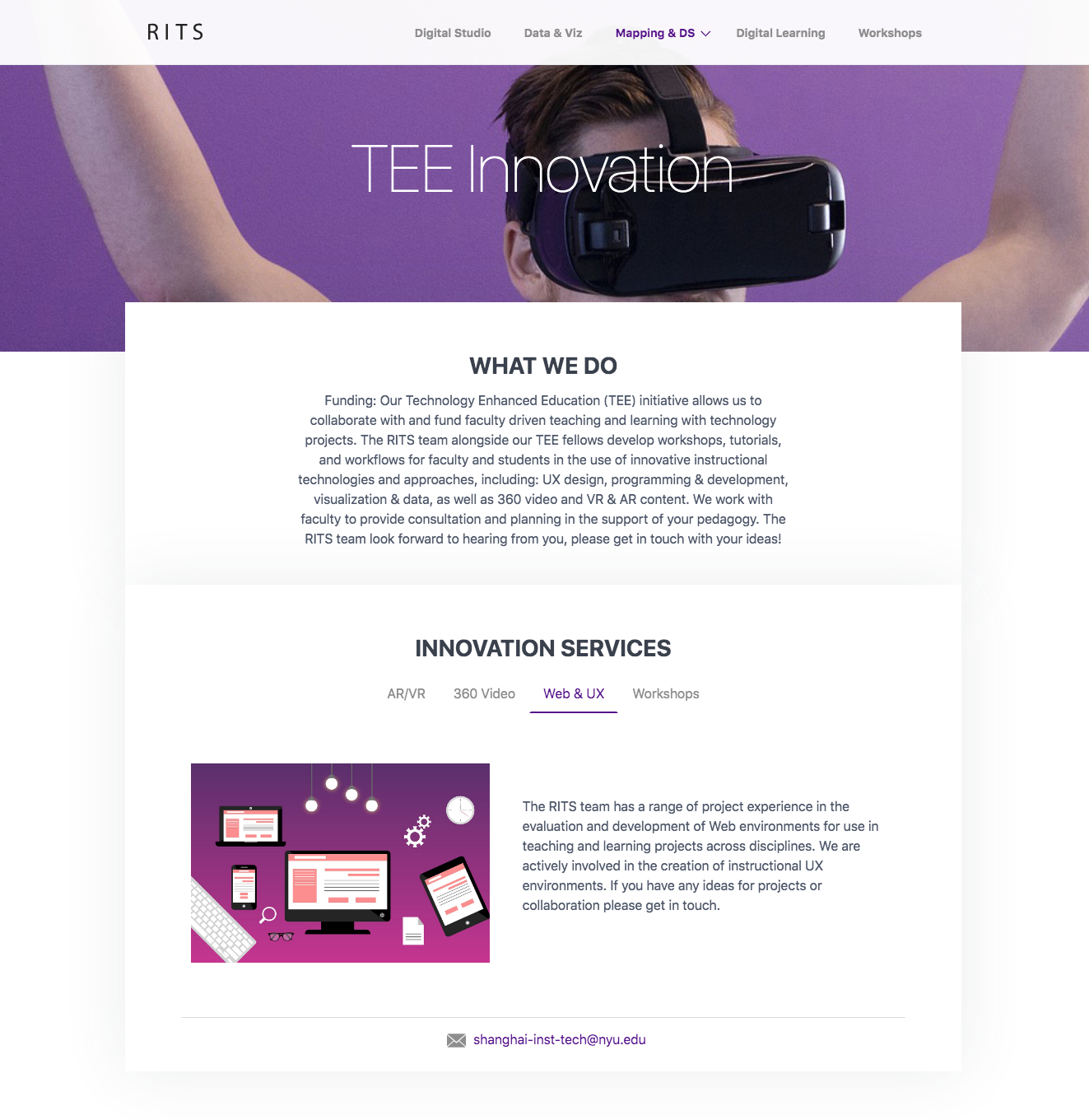
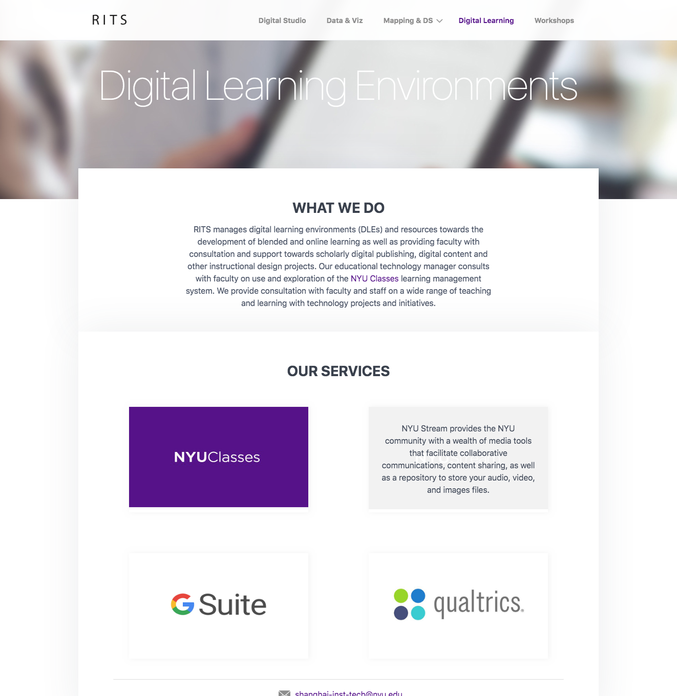
Zeerak Fayiz - Copyright 2022 ©
